Tuesday, September 9, 2025

Places I'm Visiting: Japan again

For the second time this year, I find myself in Japan. I visited in April with recreation mostly in mind. Now, in the oppressive heat and humidity of September, I'm here because my father in law, now 94 years old, is ill and not expected to live much longer. I wanted to see him before he dies. It was a hastily arranged trip. I arrived the day before yesterday. Afflicted not only by the heat but also by jet lag, it still fees a bit surreal to be here. That said, the place is familiar. I always find it easy to adjust. It feels a bit like stepping on to one of those moving walkways at the airport – a pull at the moment of transition, a momentary loss of balance, but then solid strides at a new pace. 

Unexpectedly, on my second day here, I was invited to help harvest grapes in a small vineyard on the island of Omishima in Japan's Inland Sea. I spent the morning picking clusters of Chardonnay. Japan is not a friendly place for Vitis vinifera, the wine grape vine. It is too rainy and too humid. Making wine successfully here requires various interventions not required in the dry climate I grow grapes in in Northern California.

The vines are trained in the cordon style but high above the ground. My vines at home are trained with their lateral branches at about 36 inches. The lateral branches here were at my eye level, the grape clusters hanging just below. The high training keeps the developing fruit away from ground moisture after rain. The rows of grapes are covered with transparent plastic stretched over frames to keep rain off the leaves and grape clusters. In addition, frequent use of ant-fungal agents appears to be required. Despite these efforts, there was considerable rot in the clusters we picked. Much of the time it took to harvest about a ton of grapes was occupied in removing bad grapes from the clusters one by one before dropping the remaining clean grapes into the collection bins. The pickers used a handy tool that was a pair of shears on one end and a set of tweezers on the other, the latter for removing bad grapes from the clusters. Later in my trip, I saw grapes being grown in Shimane Prefecture, on the Japan Sea side of the main island of Honshu. All the grapes I noticed there were being grown in greenhouses. 

We tasted three wines that the proprietors brought along, a rosé of Merlot and Muscat Bailey A, an unoaked Chardonnay from last year's grapes, and an "orange wine" from Delaware grapes. Delaware is a table grape, but the Delaware was rather good. On the nose, it was extraordinarily fruity, smelling simply of fresh grapes (which usually isn't a good sign in wine), but it turned out to be quite dry, free of excessive grapiness, and nicely balanced.  Later I tasted another Muscat Bailey A wine from this winery that had been aged 18 months in French oak. While it was a bit acidic, it was reminiscent of a Pinot Noir. I think with a little bottle age, it might even pass for a Burgundy. Most Muscat Bailey A wines I've tasted in Japan in the past have been modeled on Bordeaux wines, so this was refreshingly different. In any case, It was fun to spend a morning with people dedicating themselves to trying to make good wine in difficult conditions.

We were among about eight volunteers helping out. Omishima is about an hour away from the town of Hojo (now part of the city of Matsuyama) where I was a high school exchange student in 1977, now 48 years ago. A couple of the people helping out turned out to be from Hojo and, in the course of chatting while we worked, it became clear that I had met one of the volunteer grape pickers those 48 years ago, when I was 17 and he was about 13. Wandering around Hojo in October of 1977, a few days before the annual autumn festival in the town, I had come across a group of boys polishing the hardware on a danjiri (a wheeled, portable shrine used in the festival) and practicing their drumming. One of the boys had called me over and let me bang on the drum a bit. The man I was chatting with, harvesting grapes beside me, told me that he was that boy. I don't remember the encounter as well as he does (having been the only caucasian in a town of 30,000 people, I stood out. I didn't always know people who knew me, or at least knew of me). I don't recall drumming, but I do remember the boys polishing the hardware. Small world. 


Monday, September 1, 2025

Art I'm Making: Untitled Collage No. 311 (Santa Rosa)

Here's a collage from early this year. This is Untitled Collage No. 311 (Santa Rosa). Completed February 26, 2025. Acrylic on paper, acrylic monotype, collage. Image size: 12.7cm x 25.4cm (5.0in x 10.0in). Matted to 11in x 14in. Signed on the mat. Signed and dated on the reverse. 

For more of my abstract monotype collage work, visit my website at http://ctalcroft.wix.com/collage-site/ or you can purchase my recently published book commemorating ten years of working in the collage medium – Colin Talcroft: Abstract Monotype Collage: 2103–2023 (ISBN 979-8-218-37717-5). Available on the website.

In person, my work can be seen at Calabi Gallery in Santa Rosa, Hammerfriar Gallery in Healdsburg, and at the Ren Brown Collection in Bodega Bay or in my studio by appointment. Sadly, however, Calabi Gallery is closing (although it will maintain an online presence)– a great loss for Santa Rosa and Sonoma County. 

Sunday, August 24, 2025

Places I'm Visiting: 140 New Montgomery Street, San Francisco

Yesterday, I drove into San Francisco to attend an open house at Crown Point Press, on Hawthorne St. I had to leave the event fairly early to take part in a zoom call about Art Trails, Sonoma County’s premier open studios event scheduled for the second two weekends in October. I had brought my laptop along in the car to join the meeting. I parked on the street near The San Francisco Museum of Modern Art (SF MOMA) after leaving the Minna St. Garage to listen to the call and left the key in the ignition. It must have been turned to the standby position as, 40 minutes later, my battery was dead.

I called AAA and, while I waited for a battery jump to arrive, I strolled around the neighborhood and found myself in front of the building at 140 New Montgomery Street, a building I’ve often admired looking up from the patio outside the café at SF MOMA. It has some great exterior decoration in the Art Deco style, especially near the top of the tower, but I had never been in the building, so I stopped in for a look at the lobby. 

According to Wikipedia and other sources, it was built as the headquarters of the Pacific Telephone & Telegraph Company, completed in 1925, so it has now stood for a century. It is 26 storeys high. Apparently, it was referred to as simply the Telephone Building although its official name was the Pacific Telephone & Telegraph Company Building (not surprisingly), and, later (after 1984), as The Pacific Bell Building or The PacBell Building. 

At completion, it was the tallest building in San Francisco, and, along with the Russ Building, which was the same height (built two years later), it retained that honor until 1964. AT&T sold the building in 2007 after which it remained empty for about six years before a renovation that updated the interior and adapted it to mixed office use. It was designed by architects Timothy L. Pflueger, James Rupert Miller, and Alexander Cantin of architecture firms Miller and Pflueger and Perkins & Will. Construction began in 1924. The doors opened in May 1925. Wikipedia says the building's design was influenced by Eliel Saarinen’s Tribune Tower, in Chicago, particularly the stepped setbacks on the upper floors (Eliel Saarinen was the father of Eero Saarinen, who designed the beautiful TWA Flight Center at JFK International Airport, probably the first important building I ever experienced, as a child living in Brooklyn).

Reflecting its connection with the Bell Telephone company, terra cotta decorations on the façade and decorations in the lobby feature bell motifs. There is a large bell over the arched front entryway, for example, and there are bells in the metalwork around the elevators inside. It was the large statues of eagles at the top of the building that first caught my eye when viewing it from SF MOMA (always putting me in mind of the main train station in Milan; I neglected to photograph the eagles yesterday). According to Wikipedia again, the eagles are each 4m high and originally made of granite, but those visible today are fiberglass replicas of the originals, which were damaged beyond repair in the 1989 Loma Prieta Earthquake. 

In the lobby, most striking are the superbly polished stone floors, the dark marble walls, intricate metalwork detailing, the chandeliers, and the fancy ceiling decorated with botanical motifs, clouds, dragons, and phoenixes. The ceiling looks like a Chinese textile. Wikipedia also notes that Winston Churchill visited the building in 1929 and that from it he made his first transatlantic phone call, to his home in London (presumably routed through somewhere like New York on the East Coast). As I’ve always wondered about 140 New Montgomery St., I didn’t let my battery issue perturb me too much. I enjoyed the opportunity to see the historic lobby and to learn a little about this interesting structure. 

Wednesday, August 20, 2025

Art I'm Making: Untitled Collage No. 310 (Santa Rosa)

Here's a comparatively recent collage. This is Untitled Collage No. 310 (Santa Rosa). Completed February 25, 2025. Acrylic on paper, acrylic monotype, collage. Image size: 14.0cm x 28.8cm (5.5in x 11.3in). Matted to 11in x 14in. Signed on the mat. Signed and dated on the reverse. Click on the image for a larger view.

For more of my abstract monotype collage work, visit my website at http://ctalcroft.wix.com/collage-site/ or you can purchase my recently published book commemorating ten years of working in the collage medium – Colin Talcroft: Abstract Monotype Collage: 2103–2023 (ISBN 979-8-218-37717-5). Available on the website.

In person, my work can be seen at Calabi Gallery in Santa Rosa, Hammerfriar Gallery in Healdsburg, and at the Ren Brown Collection in Bodega Bay or in my studio by appointment. Sadly, however, Calabi Gallery is closing at the end of this month – a great loss for Santa Rosa and Sonoma County, California.  

Friday, August 8, 2025

Books I'm Reading: The Woman Who Smashed Codes

Jason Fagone’s The Woman Who Smashed Codes is an engaging biography that focuses attention on Elizebeth Smith Friedman (she spelled her name Elizebeth, rather than Elizabeth), a woman I had never heard of. I picked up the book recently for a dollar at a thrift store simply because I have some interest in codes and spycraft and it looked interesting. 

Friedman was a pioneer of American cryptology. She virtually established the field in the US along with her husband, William Friedman. Her work shaped modern codebreaking at a fundamental level. The book shows that her methods and successful code breaks influenced the outcome of both WWI and WWII. The book is carefully researched and written in clear, readable prose. I found it hard to put down. I read all 345 pages in only two sittings (427 pages including the notes). In her lifetime, her work and contributions to cryptology were frequently obscured by the requirements of government secrecy and often she was overshadowed by the accomplishments of her more famous husband, but the book makes a convincing case for thinking they were at least equals. 

The first part of the book focuses on Elizebeth’s serendipitous, somewhat bizarre introduction to pattern analysis when she accidentally lands a job with one George Fabyan (another character I had never heard of) as an assistant to one of Fabyan's hangers-on (Elizabeth Wells Gallup) who was obsessed with proving that Shakespeare's plays were actually written by Francis Bacon and that Bacon encoded secret messages in the texts of the plays, a pursuit that Fabyan supported and Miss Smith doggedly stuck with under Gallup's tutelage until it became clear to her that the idea was nonsense. It was at Fabyan's Riverbank compound in Geneva, Illinois that Miss Smith got her start in codebreaking and also where she met William Friedman. 

From these beginnings working side-by-side with Friedman, she became a crack codebreaker working on her own to take down rum-running gangs during prohibition and later breaking Nazi codes and helping to lay the foundation for the National Security Agency. Author Fagone combines historical detail with personal narrative, showing in detail how her work dismantled domestic smuggling operations and exposed Axis espionage networks in South America during WWII. Her feats of codebreaking made significant contributions to Allied successes during the war but they could not be publicly acknowledged. Among the book’s strengths is how it challenges the male-dominated narrative of intelligence history in the US, in particular, showing how much of the work she and her teams did (working mostly for the US Coast Guard) was attributed to others when shared with agencies such as the FBI. J. Edgar Hoover appears to have routinely passed off Coast Guard cryptanalysis as work done by the FBI. Because of the need for secrecy in many cases, Elizebeth was never in a position to set the record straight. Here, Fagone has done that. He not only restores her legacy but also explores the emotional toll on both her and her husband of lives spent in secrecy, dealing with the pressures of wartime service, and of the personal sacrifices they made (William Friedman was largely responsible for breaking Japan's "Purple" code during WWII, a code generated by Japanese code machines similar to the Nazi Enigma machines).

I rarely read reviews of books I've read, but, for some reason, I looked at reviews of The Woman Who Smashed Codes at Goodreads and found a wide spread of reviews. Most were four stars. Slightly fewer were five-star reviews. Clearly, the book has been well received by readers. However, there were also many two-and one-star reviews. These were mostly based not on the content of the book or the research but aimed at the presentation. Many complained that the narrative is not strictly chronological or that it gets mired in detail about subjects these readers thought unimportant to the story (for example, not a few of the reviews object to the large amount of space devoted to George Fabyan and the main character's time working for him). Others felt there was too much space devoted to William Friedman and that the book buries Elizebeth's story in his story, once again shrouding her life behind that of her spouse. 

In contrast, I found these sections interesting, important in elucidating Elizebeth's character, and not out of proportion. The book, in my view, makes a convincing case for the importance of Elizebeth Smith Friedman's life to US and world history and it seems a worthwhile book for having done that. I suspect (although I have no evidence to support this guess) that many of the negative reviews were written by younger readers who have lost the capacity to take in a story at its own pace, to savor details, to enjoy tangential explication. These may be the same people who can't sit through an older movie because it requires them to pay attention to dialogue and character development – people who require entertainment to incessantly bludgeon them with stimulation. It would be interesting to see a graph of the ratings on one axis and the ages of the reviewers on another. Maybe I'll post this review on Goodreads. I'd give the book five stars. 


Wednesday, August 6, 2025

Art I'm Making: Untitled Collage No. 307 (Santa Rosa)

Here's another collage from last autumn. This is Untitled Collage No. 307 (Santa Rosa). Completed October 20, 2024. Acrylic on paper, acrylic monotype, collage. Image size: 37.6cm x 28.2cm (14.8 x 11.1 inches). Matted to 24 x 20 inches. Signed on the mat. Signed and dated on the reverse. 

Click on the image for a larger view.

For more of my abstract monotype collage work, visit my website at http://ctalcroft.wix.com/collage-site/ or you can purchase my recently published book commemorating ten years of working in the collage medium – Colin Talcroft: Abstract Monotype Collage: 2103–2023 (ISBN 979-8-218-37717-5). Available on the website.

In person, my work can be seen at Calabi Gallery in Santa Rosa, Hammerfriar Gallery in Healdsburg, and at the Ren Brown Collection in Bodega Bay or by appointment.

Saturday, July 26, 2025

Plants I'm Growing: Garden produce

The garden is finally starting to produce. We got a late start this year because I was away in Japan in April – just when we normally set out starts and plant seeds – and this has been an extraordinarily cool summer so far. Something I read suggested  Northern California has been having its coolest summer since some time in the 1980s. Normally, the grapes have fully taken on color by now, but veraison has barely started. Harvest will be late.  

However, we're still getting lettuce and spinach, and we're now getting green beans, arugula, mustard greens, zucchini, other squash, poblano peppers, Fresno peppers, and green peppers. The first tomatoes have been a small variety called "Jaune Flamme" (or "yellow flame") that I've not grown before. It's not a cherry tomato but it's not a full-sized tomato either. It's one of those hat has fruit about the size of a golf ball. It's meaty and very flavorful. I'll look for it again in the future. 

Books I'm Reading: The Age of the Horse

I’ve just finished reading Susanna Forrest’s The Age of the Horse (Atlantic Monthly Press, 2016), subtitled “An Equine Journey through Human History.” The book offers a sweeping look at the shared histories of horses and humans, starting with a short section on equine evolution, from the earliest horse-like species about 56 million years ago to the present day. Although a history, the ideas are presented not strictly chronologically but by tracing a number of themes that the author likens to “bridle paths” with sections headed wildness, culture, power, meat, wealth, and war.

The treatment of evolution and domestication traces the shift from Eohippus to Equus caballus, the modern horse, and outlines how wild horse populations have been subdued and made into work partners and food sources in different parts of the world. She discusses everything from Mongolia’s wild takhi herds, the haute école riding displays at Versailles, newly established polo clubs in Beijing, and equine therapy programs for veterans in Arlington, Virginia, drawing on personal anecdotes and archival materials to illustrate how horses have served as labor, as instruments of war, as symbols of wealth and status, and as food. The section discussing the history of humans consuming horses for food and the various ways horse carcasses have been made use of in different periods and cultures I thought particularly interesting. One line, on Page 230, mentioned the boiling of horse’s hoofs for the production of Prussian Blue, a connection that I didn’t quite understand (and one that is not elaborated on in the text). That sent me to the Internet to investigate – which kept me occupied for the better part of a day (details here).

An interesting and enjoyable read. I thought it engagingly written despite a fair number of horse-specific terms that I had to look up along the way. Recommended. 


Tuesday, July 22, 2025

Miscellaneous: Thinking about Prussian Blue


Words and phrases, when overused, can be annoying. I have to say that I’m tired of hearing people call things “iconic” for one. I’m also tired of hearing about people “going down a rabbit hole,” especially when going down a rabbit hole is described as a chore in tones of feigned exasperation, but diving deep into a subject out of curiosity is a joy. I spend half my waking hours down rabbit holes and, thanks to the Internet, exploring underground tunnels is much easier than it once was. There’s no longer much of an excuse for not knowing anything you might want to know. The best one can do, it seems, is to point to the number of hours in a day when making excuses for ignorance. 

I’m down a rabbit hole as I write this. Or perhaps I should say this post is the partial record of a rabbit hole expedition. You've been forewarned.

I’ve read that more than half the people in the United States never read a book after leaving high school (poking my head briefly underground into the opening of a new burrow, I found estimates ranging from 33% to 68% with the most credible-sounding estimate I could find – from The National Endowment for the Arts – being 58.5%). Thus, I’m in the roughly 40% of the population that does continue to read. At present, I’m in the middle of The Age of the Horse (Atlantic Monthly Press, 2016), by Susanna Forrest, a book that traces the history of the equine species and their interactions with human beings through history. On page 230, in a section of the book discussing equiphagy and how horse carcasses have otherwise been consumed, I came across a line that, yes, sent me down a rabbit hole – the rabbit hole I am in at present. The line “The hoofs themselves were boiled for glue, combs, toys, or Prussian Blue” stopped me in my tracks. Horse’s hoofs and Prussian Blue?

I started searching for a connection between horse hoofs and Prussian Blue. Being a dabbler in the arts, I thought myself quite familiar with Prussian Blue. I had no recollection of any connection with horse’s hoofs and it seemed to me that a horse’s hoof is probably mostly keratin (the stuff our fingernails are made of), which seemed to me unlikely as a source of Prussian Blue. And so, I began digging. 

First, I looked into hoofs. I confirmed that a horse’s hoof is, in fact, mostly keratin. Setting that aside for the moment (keratin seemed rather inert), I dug into the history of Prussian Blue. If you’re not immediately familiar with the color, it’s what Crayola began calling “Midnight Blue” in its big crayon boxes in 1958 (because they thought most children by that time no longer understood a reference to Prussia). It is the blue of cyanotypes, blueprints, and the blue of Picasso’s Blue Period.

It was discovered by accident in Berlin in 1704 (some sources say 1706, apparently in error) when pigment and dye supplier Johan Jacob Diesbach, attempting to make Florentine Lake, ran out of the potash used in the Florentine Lake process. He called on another Johan, Johan Conrad Dippel, who topped up his potash supply. Dippel sold him potash contaminated with animal blood (apparently, that was accidental; Dippel used potash in the production of “Dippel’s Oil,” which involved boiling animal parts). When Diesbach went back to making Florentine Lake, he was surprised when the end result was not the reddish pigment he was trying to make but a deep blue, slightly greenish pigment – what came to be known as Prussian Blue or Berlin Blue – in chemical terms an oxidized ferrous ferrocyanide salt (Fe 4[Fe(CN) 6]) or simply iron ferrocyanide. In the Color Index Generic Name Code System (more about that later), Prussian Blue is PB27.

At this juncture, where to turn? What did Diesbach and Dippel do when it became clear that the contaminated potash caused the reaction resulting in Prussian Blue? Why did the animal contamination cause the unexpected reaction? What exactly is Florentine Lake? What is a lake? Although I already knew something about several of these topics, I wanted to know more.

Being a painter, I had some idea of what a lake is – essentially, a lake is a pigment made from a dye. So, what’s the difference between a dye and a pigment? The color in a dye is dissolved in the medium that carries it, while a pigment is a very finely powdered solid. Pigments are made into paints by suspending their particles in a medium but the particles are not dissolved in the medium. A lake is made by binding the dissolved color in a dye with a mordant. A mordant combines with the dye chemically to create a stable, colored substance that, unlike a dye, will not wash away easily – a pigment. Dyes, particularly dyes derived from organic sources, are often fugitive (that is, they are not colorfast; they fade badly). Most traditional lakes have been replaced by more permanent synthetic pigments that are chemically different but mimic their historical antecedents. 

I wasn’t familiar with Florentine Lake. I learned that it is a transparent reddish pigment with bluish undertones and that it was made from a dye derived from kermes insects (a group of scale insects, in this case mainly Kermes vermilio), dried and crushed. Kermes vermilio is a parasite that lives on the Kermes Oak (Quercus coccifera) and the Palestine Oak (Quercus calliprinos), both native to the Mediterranean area. This is the source of a crimson dye that has been used since antiquity. “Kermes,” I learned, is the ultimate source of our word “crimson” in English. Florentine Lake then is a red pigment made from this crimson dye. (Genuine Florentine Lake is still available from at least one source, The Alchemical Arts, in Australia.)

The story of a scale insect producing a red dye is very familiar. I’ve written here about cochineal on a number of occasions, most recently regarding an extraordinary red garment dyed with cochineal that is housed in the Murakami Kaizoku Museum on the island of Oshima in Japan’s Inland Sea. Cochineal (Dactylopius coccus), like Kermes, is a parasitic scale insect but it lives on cacti in the genus Opuntia, which comprises plants native to the Southwest United States and Central and South America. Cochineal insects are the source of carminic acid from which the dye carmine is made, and, yes, there was a traditional Carmine Lake pigment, now in most applications superseded by synthetic equivalents (although cochineal is still used as a food coloring). 

So, Prussian Blue was a mistake. Dippel knew immediately when he heard about the new blue pigment that his potash must have been the cause. According to my Internet sleuthing, nitrogen from blood in the potash Dippel supplied formed cyanide compounds such as potassium cyanide when heated. Mixed with the iron sulfate Diesbach used in making his Florentine Lake, the potassium cyanide participated in a reaction leading to formation of potassium ferrocyanide, which, in the presence of iron sulfate, creates iron ferrocyanide, or Prussian Blue. Apparently Diesbach and Dippel had a monopoly on the new pigment until others figured out how to replicate it. The formula was first published in 1724 (although Prussian Blue had already been replicated by others somewhat earlier) so Diesbach and Dippel controlled the Prussian Blue market for about a decade and a half after the pigment’s discovery. Prussian Blue is often cited as the first modern synthetic pigment.

Something I read noted that genuine Prussian Blue, or pure iron ferrocyanide, is not entirely stable, mainly because it tends to degrade in alkaline environments and with exposure to light (more about the latter below). This led me to material on pigments published on line by Jackson’s Art. It seems that genuine Prussian Blue is acceptably stable when used in making watercolors or oil paints. Acrylic media, however, are alkaline, so true Prussian Blue acrylic paints are rare (Australian paint maker Derivan is about the only paint maker that sells a true Prussian Blue acrylic paint, noting that it is not stable). Acrylics sold as Prussian Blue are almost always labeled “Prussian Blue Hue” and made by mixing other pigments, often Pthalo Blue, Dioxazine Violet, and Carbon Black. That is, to the eye, the hue is replicated but the pigments responsible for the hue are a substitute. True Prussian Blue in acrylic media has mostly been replaced by more stable equivalents – superseded like the Florentine Lake that Prussian Blue stemmed from. 

At this point, I thought I had my answer. To say that boiled horse’s hoofs were a source of Prussian Blue seemed inaccurate. Rather than hoofs, per se, it seemed likely that blood in tissues connected to hoofs removed from horse carcasses provided the nitrogen for the Prussian Blue reaction rather than keratin itself. Unless…keratin is a good source of nitrogen. Apparently, it is. I suspect that both blood and keratin were used as a nitrogen source in making traditional Prussian Blue and it probably came from multiple animal sources.

I could have stopped there, but there was more on my mind. Again, as an artist, I’m quite familiar with Color Index Generic Name Codes (usually referred to simply as pigment codes). I knew that pigments used in artist’s colors can be reliably identified by their pigment codes, which operate much like Latin names in biology. They are standardized and recognized globally, eliminating confusion caused by overlapping common names, alternate names, traditional names no longer used, and language differences. According to Jackson’s Art, the Colour Index International is a database of pigments and dyes published by the Society of Dyers and Colourists and the American Association of Textile Chemists and Colorists. The Index was created just over 100 years ago, in 1924. 

Prussian Blue has the code PB27. It would be natural to assume that “PB” here stands for “Prussian Blue,” but it doesn’t. It’s a misleading coincidence. The color codes for pigments (as opposed to dyes) all begin with the letter “P.” Blue pigments are all coded “PB” for “pigment blue”.  Yellow pigment codes, by the same logic, are all “PY” followed by a number. Red pigments are all coded “PR” followed by a number, etc. The number indicates the order in which each pigment was added to the official database. If Prussian Blue was the first modern synthetic pigment, you might expect it to be “PB1,” but, because iron ferrocyanide was the 27th blue pigment added to the database, its code is PB27. While the numbers tell us little more than how recently a pigment was recognized in this particular coding system, the codes have the virtue of telling artists precisely what compounds are in their paints. A tube of acrylic Prussian Blue marked PB27 is likely to be unstable. A tube marked PB15, PV23, PBk7 is the stable Prussian Blue mimic described above made from Pthalo Blue, Dioxazine Violet, and Carbon Black. Most artists want their work to last, so, that’s a good thing to know. On another tangent altogether, I’ve noticed independently that mixing paints labeled “Ultramarine” and “Viridian” produces a hue very close to what we call Prussian Blue. I will refrain from going into the history of the colors Ultramarine and Viridian here – although I’m tempted to.

Having said all of the above, I hadn’t realized that, because the pigments identified using these codes are sometimes natural pigments (derived directly from earth or clay, for example), they are not always the same hue. A case in point is PBr7 (brown pigment number seven). As it’s a manganese-containing, naturally occurring iron oxide, the hues it produces in paints can vary somewhat. In addition, processing can change the hues expressed by a single pigment dramatically. PBr7 identifies the iron oxide pigment that is expressed as both Raw Umber and Burnt Umber – two obviously different hues. So, while the codes always identify the pigment, they don’t necessarily always exactly identify the hue we see – although they pretty much do in the case of synthetic pigments, which are pretty much uniform.

Then, not wanting to spread misinformation, I started wondering if I remembered correctly that the blue we call Prussian Blue is the same blue formed in the cyanotype process and in traditional blueprints. Upon more research online, I was relieved to confirm that these processes do create iron ferrocyanide, or Prussian Blue. 

One odd fact about the cyanotype process is that cyanotypes are known to fade over time with exposure to light. That’s not unusual. Fading is a common phenomenon. What’s weird about cyanotypes is that the depth of color in a faded cyanotype recovers in darkness. That I knew, but why? And is the same phenomenon observed in, for example, oil paintings that use genuine Prussian Blue, or in the Japanese print style known as aizuri-e in which the image is produced almost entirely in shades of Prussian Blue? Prussian Blue when newly available in Japan became known as ベロ藍 (bero-ai) with “bero” derived from “Berlin” and “ai,” meaning indigo (although today you’re more likely to hear it called プルシアンブルー (purushian burū) in Japanese, directly from the English), reflecting its first synthesis in Berlin. The plant-derived pigment we call indigo, however, is not the same as Prussian Blue. Several different plant species have been used as the source of natural indigo over the centuries, notably true indigo (Indigofera tinctoria) and other species in the genus Indigofera, but also the unrelated plants woad (Isatis tinctoria) and Japanese Indigo (Polygonum tinctorium). All of these produce natural indigo, which is C16H10N2O2, unrelated chemically to iron ferrocyanide. It’s only the similar hue that links indigo to Prussian Blue.

But I was wondering about the recovery of cyanotypes in darkness.
What’s going on here? The now-ubiquitous AI bot that answers Google queries tells me that with exposure to visible light, Prussian blue undergoes photochemical reduction – resulting in a fading caused by the gradual conversion of ferric ions in Prussian Blue to ferrous ions, which, apparently appear not blue but white. A reduction reaction is the opposite of an oxidation reaction. In reduction, a molecule loses oxygen. In oxidation, the reverse happens. Happily, in the presence of oxygen in darkness, this reaction is reversible, at least in part, with some ferrous ions oxidizing back to ferric ions, restoring the blue hue. As cyanotypes (and aizuri-e) generally are not given a surface treatment, this restorative reaction likely occurs fairly easily, but I’m guessing that oil paintings using Prussian Blue are less able to undergo the reversal reaction because they are often finished with a varnish that blocks oxygen – but perhaps the varnish also inhibits the fading?  

Maybe that’s enough for one day. I started writing at about 10:00AM. It’s now going on 4:00PM. I need food. Time to climb back into the open air.

Then, unable to resist, I asked Google if faded aizuri-e prints can be restored in darkness. The bot says no – which leaves me puzzled. I don’t understand why Prussian Blue in a cyanotype would behave one way while the same pigment in an aizuri-e would behave differently. Maybe the bot is wrong. In any case, I need to eat something.

Except that, asked the same question about Prussian Blue in oil paintings, the bot suggests that the pigment in oil paintings can, in fact, undergo the reversion reaction (although the reaction and the initial fading in Prussian Blue oil paint, if any, can be affected by admixtures of other pigments). So why not in the case of aizuri-e? And what about the blues in blue and white Japanese and other ceramics? Is that Prussian Blue?  

I’m going now. Really.

[Edit: It occurred to me shortly after posting this that blue and white ceramics in Japan – for example, the famous ceramics from Imari in southern Japan – predate Prussian Blue. Imari became a center of ceramics production in the early 1600s. Prussian Blue was first synthesized about 100 years later and it didn't become widely used in Japan for another 100 years. The heyday of aizuri-e was the 1820s to 1840s. Traditional blue and white ceramics in Japan used (and still use) cobalt-based blue underglazes, as in China. Cobalt blue ceramics first appeared in China during the Tang dynasty (618-907).]

[Additional info: Two days later, still poking around, I came across this interesting tidbit: The term "lake" that I discussed here has the same root ("lac") as the "lac" in "lacquer" and "shellac." This "lac" refers to yet another scale insect, in this case Kerria lacca (formerly known as Laccifer lacca, Coccus lacca, or Tachardia lacca – aparently reclassified a number of times or split). I had known that "lacquer" and "shellac" were related to insect secretions but I hadn't made the connection with "lake" meaning a dye-derived pigment. Kerria lacca, like the cochineal insect and Kermes vermilio, has historically been the source of a red dye. That dye, according to some articles I've read was the first or one of the first to be precipitated as a pigment, or lake, and, eventually, the term "lake" came to be used for any such pigment.] 

Friday, July 18, 2025

Art I'm Making: Untitled Collage No. 306 (Santa Rosa)

Here's a collage from last autumn. This is Untitled Collage No. 306 (Santa Rosa). Completed October 7, 2024. Acrylic on paper, acrylic monotype, found paper, collage. Image size: 37.8cm x 28.4cm (14.9 x 11.2 inches). Matted to 24 x 20 inches. Signed on the mat. Signed and dated on the reverse. 

This one is a bit unusual for me as it's collaged elements on a substrate. Normally I don't work on a base of any kind. I simply glue together scraps into "rafts" of joined paper. The central pinkish and brick red elements are printed directly on the underlying sheet in this case. All the other elements are collaged bits on top. This one, at almost 15 inches x 11 inches, is also comparatively big for me. Click on the image for a larger view.

For more of my abstract monotype collage work, visit my website at http://ctalcroft.wix.com/collage-site/ or you can purchase my recently published book commemorating ten years of working in the collage medium – Colin Talcroft: Abstract Monotype Collage: 2103–2023 (ISBN 979-8-218-37717-5). Available on the website.

In person, my work can be seen at Calabi Gallery in Santa Rosa, Hammerfriar Gallery in Healdsburg, and at the Ren Brown Collection in Bodega Bay or by appointment.


Wednesday, July 16, 2025

Plants I'm growing: Is it all arugula?

I love the pungent leaves of the plant that I call "arugula." Nothing spices up a salad like arugula, but there appears to be a great deal of confusion surrounding this arugula (Latin name, Eruca sativa). It has many common names (besides arugula, referred to as rocket, rocket salad, roquette, rucola, and garden arugula, among others, with arugula and rucola coming from the Italian and rocket and variants coming from the French roquette) and it's often confused with (or wrongly thought to be the same as) Diplotaxis tenuifolia, which likewise has a number of common names; I've seen it called wild arugula, perennial arugula, perennial wall arugula, and, in plastic bags at the supermarket "baby arugula." While both are in the mustard family (Brassicaceae), they are not in the same genus and therefore not closely related. 

I know the two are distinct simply because the Latin names differentiate them, which is the whole point of Latin names – to distinguish between plants and animals with overlapping common names and different names in different languages around the world, but I also know how different they are because I grow both types in my garden. Eruca sativa, which comes up from seed quicker than just about any other plant I've ever sown, is an annual that grows quickly, producing flat, notched leaves typically about three to six inches long. It is fairly quick to bolt in the summer. Its flowers, on stems up to about 18 inches tall, are typical mustard family flowers with four   petals in a bilaterally symmetrical arrangement, pale cream colored with fine, dark, purplish veining (see photos below). 

Diplotaxis tenuifolia looks altogether different. The leaves are shorter, narrower, and more heavily if not more deeply notched. It forms mounds of dainty foliage, growing up to about 24 inches high or as much as about 36 inches including the long, thin flower stalks. The flowers are again typical mustard family flowers with four petals, but the flowers are a plain, unveined yellow (see photos). Finally, Diplotaxis tenuifolia is a perennial.  

What the two plants have in common is the presence of chemicals in the leaves of glucosinolates that break down into isothiocyanates, which as a group (if I understand correctly) are referred to as "mustard oils." These are the compounds responsible for the sharp and bitter flavors we know from mustard, radishes, watercress, capers, and others – including arugula, or rucola, or rocket, or roquette, or perennial arugula. The two plants smell and taste similar, so they share names, despite their taxonomical distance.

I find it frustrating that there seems to be no agreement about the common names. I've seen almost all of the names listed above for Eruca sativa used for both plants. I've even seen Japanese mizuna (which is another mustard family plant altogether, Brassica rapa var. nipposinica or Brassica rapa var. japonica) erroneously referred to as "arugula." While the Latin names clear things up and I'm perhaps a nerd, I'm not nerdy enough to ask for Diplotaxis at the supermarket. It's bad enough when I pronounce shiitake properly and they have no idea what I'm talking about. 


Sunday, July 13, 2025

Art I'm Looking At: Quilts at the Berkeley Art Museum and Pacific Film Archive

Over the past weekend, I stopped in at the Berkeley Art Museum and Pacific Film Archive to see the main show on now – a show of quilts by black Americans called "Routed West: Twentieth-Century African American Quilts in California." The show, which runs through November 30, looks at quilts in the context of the Second Great Migration of black Americans out of the South (1940-1970) in search of work and better treatment than they were accustomed to in the South. It comprises about one hundred quilts either made in the South and transported to California through migration or made in California by migrants to the state from the South. It is the first show that draws on a large collection of quilts donated to the museum in 2019 by a life-long collector. 


The earliest pieces in the show were made by women born into slavery
. The most recent pieces were made by artists still living. The range of styles is diverse. Some exhibit the careful piecing, geometric formality, and intricate stitching that characterize the quilting traditions with which I'm more familiar but others display a much freer approach to materials and composition, notably a willingness (or often a need) to draw on materials at hand; there are quilts that incorporate old denim, old T-shirts, entire pieces of used clothing (one artist in the show appears to have been known for making "britches quilts" using overalls and other articles of clothing intact), neckties, and scrap fabric of all kinds. The inventiveness and beauty of some of the pieces is impressive. Well worth a look. I've attached photos here of some of my favorite pieces in the show.


Tuesday, July 1, 2025

Art I'm Looking at: Ruth Asawa, Paul McCartney, Kunié Sugiura, and Richard Diebenkorn

In the past six weeks or so, I've seen some of the major shows currently on view in San Francisco, mainly the Ruth Asawa show and work by Kunié Sugiura at SF MOMA, the Paul McCartney photographs at the De Young, and a small show of prints by Richard Diebenkorn at Crown Point Press. 

The Ruth Asawa show, which runs through September 2, brings together more than 300 pieces from all phases of Asawa's career. Like many people, I have been most familiar with her hanging wire sculptures. I was largely ignorant about the details of her career, however. The show, which is roughly chronological, offers an excellent opportunity to put the wire sculptures into context and to get a sense of the range of her activity. From the earliest work in the show, mainly from her time at Black Mountain College, to the last work she did, in San Francisco, where she eventually settled and raised a family of six children with her husband, architect Albert Lanier, it is evident that she had a deep interest in and understanding of natural forms, which appear to have been a constant inspiration. 

I particularly enjoyed seeing folded paper creations, early printed works, and some exquisite botanical contour drawings in the show, as well as drawings done using Screentone on matboard. Well worth a visit.  (Photos: Top – SF MOMA, installation view. Above, Mounted Paper Fold with Horizontal Stripes, ink on paper, 1952. Below, Photocopy of Ruth Asawa's Hand, not dated, photoelectric print.)

Also on at SF MOMA is a show of work by Kunié Sugiura, an artist I had never heard of, who appears to have been active mostly as a photographer. In the show are everything from small photomontages to very large photograms, but the show features what she refersto as "photopaintings." Sugiura's photopaintings are assemblages that combine photographic images with sculptural elements. Some of these put me in mind of Robert Rauschenberg's "combines." Others suggested Rothko with their simple pairings of diffuse, flat surfaces. I thought the photopaintings rather effective. The photographic elements function simultaneously as independent images and as abstract compositional elements within the whole of each piece. 

The show will be up through September 2025. If you're heading to SF MOMA to see the Ruth Asawa show, I recommend taking in the Sugiura show as well. (Photos: Above, SF MOMA installation view; below top, Introse BP3, toned silver gelatin print, 2002; below bottom Deadend Street, photographic emulsion and acrylic paint on canvas with wood, 1978.)

The Paul McCartney photographs now on view at the De Young
I found interesting for their historical value; they present an intimate look at life behind the scenes with the Beatles just as Beatlemania was taking off, but I found the show a bit disappointing. With a few exceptions, the photos are not especially fine as photographs. Those on view are almost all digital prints from the negatives rather than silver gelatin prints (and where negatives have been lost, digital prints from scans of contemporary contact sheets), which would have been more authentic, and many of the shots were poorly focused (which is not to say that all photographs must be in sharp focus to be worthwhile). They mostly read as incidental snapshots – which, I suppose, is what they are; McCartney makes no claims to art here. Finally, not all of the photos on display are by McCartney. A fair number include McCartney's image, taken not by him but with his camera handed to someone else, and a couple of the best shots in the show are by other photographers entirely. Color photos in Miami reveal McCartney responding as a tourist. That said, any Beatles fan will enjoy seeing the collection presented here. I thought the photo of John Lennon in Paris and a shot of Ringo and George, both shown below, among the better images.


When Yale University Press in association with The Fine Arts Museums of San Francisco and the Richard Diebenkorn Foundation, published the Richard Diebenkorn Catalog Raisonné in 2016, I acquired the set, as Diebenkorn is among my favorite artists, but I was disappointed to find that none of his many prints were included. I learned that a definitive catalog of the prints was to appear in a separate edition, and that has just appeared, almost ten years later. In honor of the publication, Crown Point Press in San Francisco (on Hawthorne St., a short walk from SF MOMA) is now doing a small show of some of the prints that Diebenkorn made at Crown Point Press. The show is small, with only about 25 pieces on the walls, but each is choice and one of the finished prints is shown alongside several proof versions, which allows a glimpse into the process of its creation. Worth a visit, but, checking the Crown Point Press website, it looks like this show may have just closed. I'd recommend calling in advance, but Crown Point Press is almost always worth a visit. 

Very close to Crown Point Press, walking along the sidewalk on Howard St., I noticed some pavement markings that looked very much like a Diebenkorn to me.  


Monday, June 30, 2025

Wines I'm Making: 2025 Cabernet and Sangiovese

The grapes in our little backyard vineyard are coming along nicely. One of the four endposts rotted through over the past winter. I finally found someone to replace it, so the drop wires supporting the canopy growth are now back in their proper position. The grapes have been dusted twice with sulfur so far this season and there are no signs of mildew. Next chore will be to put the nets on that protect the ripening grapes from raccoons and other critters. Then, it's a waiting game. Last year, the grapes were greatly damaged by yellow jackets (a problem I had not had before), so this year I have yellow jacket traps up. Hoping for the best....

Art I'm Making: Untitled Collage No. 304 (Santa Rosa)

Here's a collage from last autumn. This is Untitled Collage No. 304 (Santa Rosa). Completed September 18, 2024. Acrylic on paper, acrylic monotype, collage. Image size: 27.6cm x 16.6cm (10.9 x 6.5 inches). Matted to 20 x 16 inches. Signed on the mat. Signed and dated on the reverse. Click on the image for a larger view.

For more of my abstract monotype collage work, visit my website at http://ctalcroft.wix.com/collage-site/ or you can purchase my recently published book commemorating ten years of working in the collage medium – Colin Talcroft: Abstract Monotype Collage: 2103–2023 (ISBN 979-8-218-37717-5). Available on the website.

In person, my work can be seen at Calabi Gallery in Santa Rosa, Hammerfriar Gallery in Healdsburg, and at the Ren Brown Collection in Bodega Bay or by appointment. 

Monday, June 23, 2025

Miscellaneous: Goats

Goats have been let loose to graze in the park nearest to our house this past week. The city now uses them each year ahead of fire season to reduce combustible materials on public land. They make the neighborhood look rather European.

Art I'm Making: New Tools

A new ink stick, from Kobaien, in Japan, and a new ink stone have just arrived. I'm looking forward to exploring in black and white. I haven't worked in ink on paper in many years, but it's a medium I've enjoyed since encountering it on my first visit to Japan (as an exchange student in high school). 

Monday, June 2, 2025

Music I'm Listening to: Recent San Francisco Symphony concerts

Unusually, I recently had three San Francisco Symphony concerts on three successive Friday nights, May 16, May 23, and May 30. It's always hard to write about music but particularly hard to after the fact, so just a few highlights here, as a couple of weeks have passed already.... 

On May 16, cellist Johannes Moser joined the SF Symphony for the world premiere of Before We Fall, a cello concerto by Anna Thorvaldsdottir. It was a rather abstract piece – the sort that's difficult to process on first hearing – but rich in texture and I thought it interesting enough that I'd enjoy hearing it again or finding a recording of it. As always, Moser was superb. 

The program began with Fantasia on a Theme of Thomas Tallis, by Ralph Vaughn Williams. Conductor Dalia Stasevska handled it beautifully, I thought, without rushing but also without letting it get too lush. It was as satisfying as any recording I've ever heard of it. This was the second time I've had the privilege of attending a concert with Stasevska conducting. She seems to have established a real connection with the San Francisco musicians despite being an occasional guest conductor. She's precise, in control, and on top of things. After intermission, the Symphony played Sibelius's Symphony No. 5.

The following Friday, Isabelle Faust was the guest soloist in the Berg Violin Concerto. Esa-Pekka Salonen conducted. Also on the program were Chorale, by Magnus Lindberg, and, after intermission, Stravinsky's The Firebird. This was a concert I got tickets to by trading in an unused ticket for an earlier performance, so the seat was not especially good. When there's a soloist, I like to be right up front and just left of stage right, so I'm right in front of the soloist (D104 is my usual seat), but this time I was well off to stage left, which was a little disappointing. I did, however, enjoy Salonen's reading of The Firebird. He got a very warm welcome when he first appeared on stage and, as at other recent concerts I've attended with Salonen conducting, calls from the crowd for him to stay in San Francisco. 

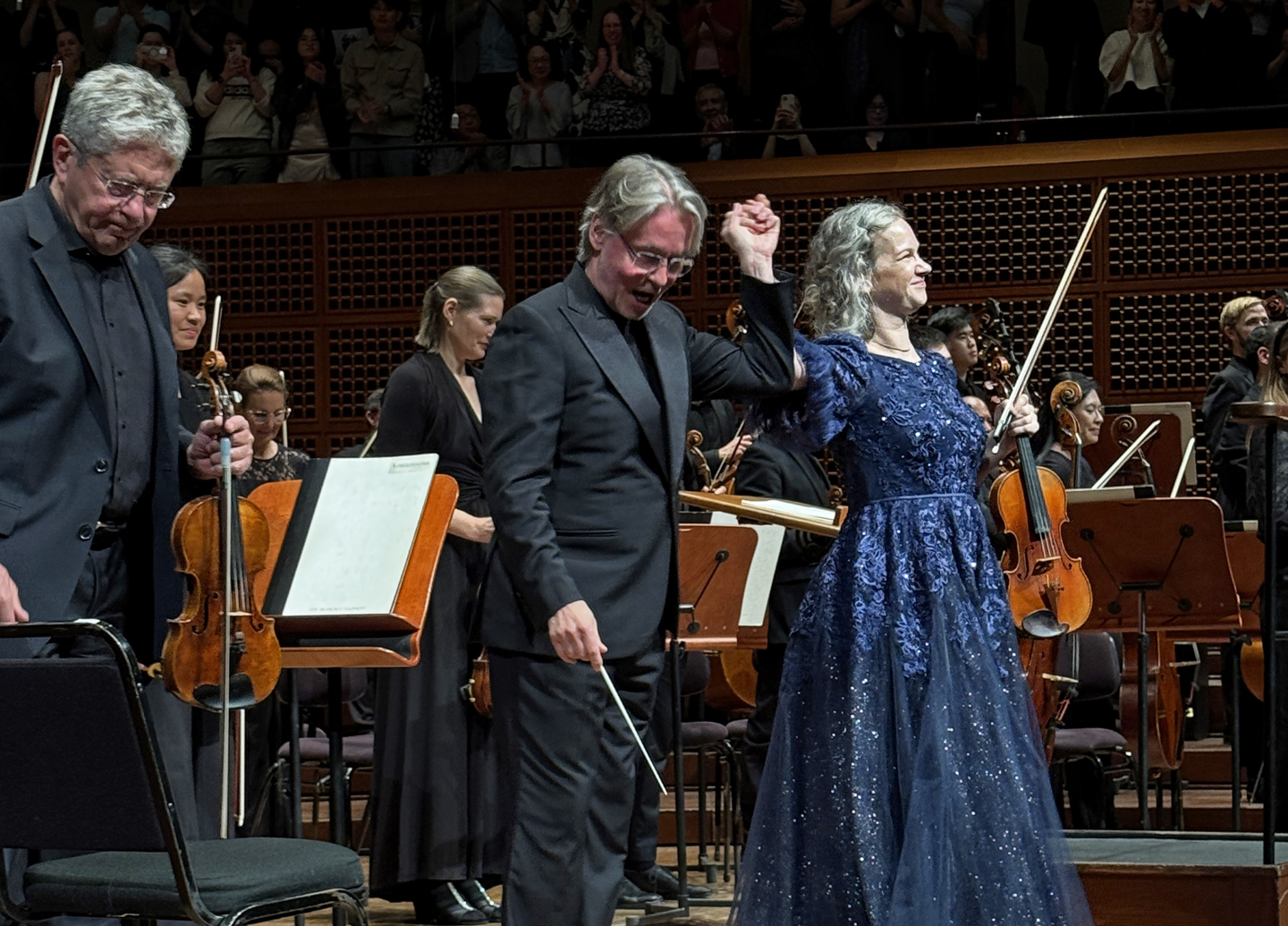
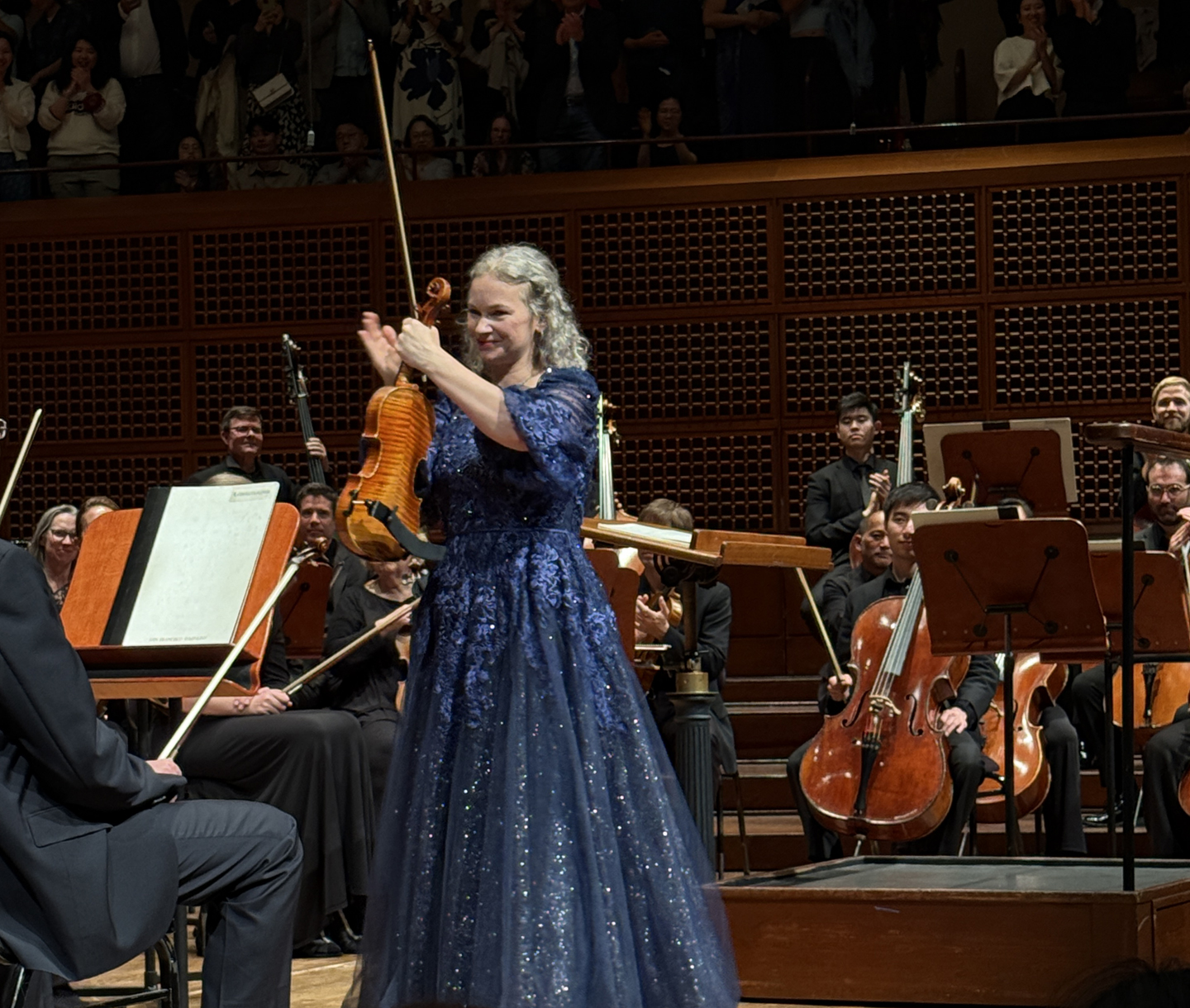
On the 30th, it was an all-Beethoven program. Beethoven's Symphony No. 4 came before intermission, his Violin Concerto was performed after intermission with Hilary Hahn as soloist. Elsa-Pekka Salonen conducted. The highlight was the concerto. Hahn was in top form. Precise, with each note articulated, and with nearly perfect intonation, but never cold or distant-seeming. A very full house gave her a long standing ovation. She came back for an encore (something from the Bach solo partitas and sonatas) and then came back for a second encore, doing a piece I didn't recognize. It's always fun to watch her during rests because she often turns her back to the audience to watch the orchestra herself and really seems to enjoy listening from what is perhaps the best 'seat' in the house. I've noticed also that she always applauds for those who accompany her. A memorable performance. 


Saturday, May 31, 2025

Related Posts with Thumbnails