Thursday, November 9, 2017
Rain: New Rain November 8, 2017
We had 1.15 inches of new rain last night, the night of November 8, 2017, which also marks a month from the wildfires here, not to mention a year with the criminal, national embarrassment. That brings our total so far for the 2017-2018 rain year to 2.05 inches.
Wednesday, November 8, 2017
Art I'm Making: Untitled Collage No. 188 (Santa Rosa)
A new collage, the first I've made since the chaos caused by the recent fires here. For those of us who did not lose everything, life is beginning to return to normal. I feel for those still sorting through the wreckage, dealing with insurance, finding a place to live, mourning the loss of possessions and, in some cases, loved ones.
Trying to move ahead, this is Untitled Collage No. 188 (Santa Rosa). October 21, 2017. Acrylic on paper, acrylic monotype, collage. 20.1 x 20.8cm (7.9 x 8.1in). Matted to 16 x 20 inches. Signed on the mat. Signed and dated on the reverse.
For more of my collage work, visit my website at http://ctalcroft.wixsite.com/collage-site
Trying to move ahead, this is Untitled Collage No. 188 (Santa Rosa). October 21, 2017. Acrylic on paper, acrylic monotype, collage. 20.1 x 20.8cm (7.9 x 8.1in). Matted to 16 x 20 inches. Signed on the mat. Signed and dated on the reverse.
For more of my collage work, visit my website at http://ctalcroft.wixsite.com/collage-site
The Cocktail Glass Collection: St. Mary's Pub, San Francisco
I've recently had reason to be in San Francisco at night more often than in the past. I'm enjoying the opportunity that's afforded to see some new neon cocktail glass signs lit. This is the sign in front of St. Mary's Pub, at 3845 Mission St., San Francisco, CA 94110. The glass itself is generic, but I like the script "St. Mary's Pub."
For more, click the "Cocktail Glass Collection" label at right at the top of the page.
Sunday, November 5, 2017
Art I'm Looking At: "Somewhere Else" at Blasted Art Gallery, Santa Rosa
Bill Shelley and Chris Beards have launched a new art space in the Backstreet Building, in Art Alley, in Santa Rosa's SOFA Arts District. I attended the grand opening of the new space on Friday night (November 3), not knowing what to expect from the outset and then feeling a bit baffled by the curtain closing off the space when I arrived for a look. There was no door, just the curtain. The entry was reminiscent of a curtained-off side gallery in a museum reserved for a video installation, projected film, or a piece of neon or other lighted art--and that was what I had expected to find.
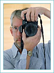
When I poked my head in, I was disappointed. First, neither Bill nor Chris was in the space, and I had come in part to say hello and lend support, but I was disappointed more because the space was simply an empty room with black-painted walls onto which a series of empty white frames of varying sizes had been hung--or, I should say, a series of framed white blanks, the frames painted white as well. My heart sank. I like these people. I wanted to like what they had done, but it seemed there was nothing much to see. The show seemed a hackneyed conceptual art piece that was immediately graspable and therefore of little interest. I left almost immediately to look at some of the other studios. I found Chris (pictured above) in a hallway. I said something polite and later was able to greet Bill on a second foray into the space. I had a little wine (and they were serving some decent wine). I talked with a few of the people visiting, mostly acquaintances. I looked at the empty frames on the walls.
Before long, the framed blanks seemed not entirely white any more. They had a slight blue-green cast, as if someone had got the color balance wrong in Photoshop. I thought that a little strange.
A few minutes later, I suddenly saw that the frames and the spaces they enclosed were not white at all, nor were they a pale, slightly blue-green sort of white, but a vivid, saturated aqua, the color approximated in the photo of Chris above. Chris later told me the color is called "Poolside Blue." I was genuinely shocked. I began to doubt my own eyes, but it became increasingly clear that it was no illusion. The "paintings" were, indeed, a blue-green reminiscent of the bottom of a swimming pool. I realized something else. When I first saw them, I had expected the mounted pieces to be white. Because of that and because my eyes took some time to adjust to the darkness in the room, I had seen them as white. It was only as my eyes became accustomed to the darkness that I was able to see the color. It wasn't long before I was doubting not the color, but that I had at first been capable of not seeing the color. And so it turns out that there was much more to see and think about in that black room than I first thought. I feel a little embarrassed that I was initially so quick to give up, but, in my own defense, I went back. I kept looking.
On one level, there really isn't much to see in the room--it's just a series of uniformly colored, framed spaces on a black wall, but during the past two days I've found myself thinking about what I saw almost constantly. The installation raises many questions about how we see, how expectations can color (literally) our perception, and how two people can see identical images very differently (there were quite a few people discussing what color they were seeing and not all agreeing). I keep asking myself: what color were the "images" on the wall? The answer depends on who you ask and when you ask.
Adding a layer of complexity, the chosen color is somewhere between blue and green. The blue/green distinction is notoriously slippery in many languages. In Japanese, for example, my second language, the word ao often stands for both the English words "blue" and "green." In Japanese the sky is ao but so is a "green" traffic light. Foliage, too, is ao. Chris and Bill chose the color deliberately for that ambiguity.
And then there is the problem of photography. When I got home to look at my photographs, they were dark and had to be adjusted. But adjust them to what? What color are those framed spaces on the wall at Blasted Art Gallery? I really can't say. When I first entered the space, they looked like the image below. When I left, they looked like the image above.
I look forward to seeing what Bill and Chris get up to in the future. The current show, "Somewhere Else" will be viewable again next weekend, November 11 and November 12, between 11AM and 3PM. Congratulations to both Bill and Chris on the new space and for presenting us with an entertaining intellectual exercise.
[Update: I later read some comments Chris wrote about the installation that mentioned the recorded highway sounds playing in the background. I didn't hear any sound. I have no recollection of a "soundtrack" to the show. I imagine I was so focused on what my eyes were telling me that I completely ignored what my ears were telling me.]
When I poked my head in, I was disappointed. First, neither Bill nor Chris was in the space, and I had come in part to say hello and lend support, but I was disappointed more because the space was simply an empty room with black-painted walls onto which a series of empty white frames of varying sizes had been hung--or, I should say, a series of framed white blanks, the frames painted white as well. My heart sank. I like these people. I wanted to like what they had done, but it seemed there was nothing much to see. The show seemed a hackneyed conceptual art piece that was immediately graspable and therefore of little interest. I left almost immediately to look at some of the other studios. I found Chris (pictured above) in a hallway. I said something polite and later was able to greet Bill on a second foray into the space. I had a little wine (and they were serving some decent wine). I talked with a few of the people visiting, mostly acquaintances. I looked at the empty frames on the walls.
Before long, the framed blanks seemed not entirely white any more. They had a slight blue-green cast, as if someone had got the color balance wrong in Photoshop. I thought that a little strange.
A few minutes later, I suddenly saw that the frames and the spaces they enclosed were not white at all, nor were they a pale, slightly blue-green sort of white, but a vivid, saturated aqua, the color approximated in the photo of Chris above. Chris later told me the color is called "Poolside Blue." I was genuinely shocked. I began to doubt my own eyes, but it became increasingly clear that it was no illusion. The "paintings" were, indeed, a blue-green reminiscent of the bottom of a swimming pool. I realized something else. When I first saw them, I had expected the mounted pieces to be white. Because of that and because my eyes took some time to adjust to the darkness in the room, I had seen them as white. It was only as my eyes became accustomed to the darkness that I was able to see the color. It wasn't long before I was doubting not the color, but that I had at first been capable of not seeing the color. And so it turns out that there was much more to see and think about in that black room than I first thought. I feel a little embarrassed that I was initially so quick to give up, but, in my own defense, I went back. I kept looking.
On one level, there really isn't much to see in the room--it's just a series of uniformly colored, framed spaces on a black wall, but during the past two days I've found myself thinking about what I saw almost constantly. The installation raises many questions about how we see, how expectations can color (literally) our perception, and how two people can see identical images very differently (there were quite a few people discussing what color they were seeing and not all agreeing). I keep asking myself: what color were the "images" on the wall? The answer depends on who you ask and when you ask.
Adding a layer of complexity, the chosen color is somewhere between blue and green. The blue/green distinction is notoriously slippery in many languages. In Japanese, for example, my second language, the word ao often stands for both the English words "blue" and "green." In Japanese the sky is ao but so is a "green" traffic light. Foliage, too, is ao. Chris and Bill chose the color deliberately for that ambiguity.
And then there is the problem of photography. When I got home to look at my photographs, they were dark and had to be adjusted. But adjust them to what? What color are those framed spaces on the wall at Blasted Art Gallery? I really can't say. When I first entered the space, they looked like the image below. When I left, they looked like the image above.
I look forward to seeing what Bill and Chris get up to in the future. The current show, "Somewhere Else" will be viewable again next weekend, November 11 and November 12, between 11AM and 3PM. Congratulations to both Bill and Chris on the new space and for presenting us with an entertaining intellectual exercise.
[Update: I later read some comments Chris wrote about the installation that mentioned the recorded highway sounds playing in the background. I didn't hear any sound. I have no recollection of a "soundtrack" to the show. I imagine I was so focused on what my eyes were telling me that I completely ignored what my ears were telling me.]
Saturday, November 4, 2017
Rain: First Real Rain of the 2017-2018 Rain Year
Overnight last night (November 4, 2017), we had a good rain, the first real rain since the start of the 2017-2018 rain year (which began on October 1, 2017 and will end on September 30, 2018) and the first appreciable rain since the fires. We had a trace of rain about a week after the fires started on the early morning of October 9, but not enough to make a difference, and things were in chaos. I didn't record the amount. It was very little--unfortunately. Rain then would have helped tremendously.
I have had no time at all to write about the fires or to write about the other things I usually write about in these pages, but I hope to get back into stride again soon. For the time being, I simply report that our rainfall so far this year stands at 0.9 inches.
Tuesday, October 31, 2017
Art I'm Looking At: Susan Stover on The Art Wall at Shige Sushi October 31 to December 31
I'm pleased to announce the next show on The Art Wall at Shige Sushi, in Cotati. We'll be showing recent work by Susan Stover, known internationally for her textile-inspired encaustics. I put up the show yesterday. Looks great. Join us on Monday, November 6, for the opening reception from 5:30 to 7:30. See the work, meet Susan, enjoy nibbles and wine...
Friday, October 27, 2017
Art I'm Making: Art Trails 2017 Second Weekend, October 28 and 29
Art Trails 2017 FINAL WEEKEND this weekend, after the one-week postponement caused by the recent, tragic fires in Sonoma County. We continue to mourn the losses here, but taking refuge in art seems one good response to the tragedy among many others. Artist studios will be open from 10AM to 5PM Saturday and Sunday, October 28 and 29. I would love to see you at Studio 61. There's much new art to see, including one or two pieces finished in the past week.
Tuesday, October 24, 2017
Art I'm Making: Untitled Collage No. 187 (Santa Rosa)
Life has been on hold for the past two weeks, but things are beginning to return to normal after the Northern California fires that hit us on the night of October 8--normal for those of us who evacuated but did not lose our houses, our studios, years of art work, loved ones.
I'm trying to catch up with posting new art. This is Untitled Collage No. 187 (Santa Rosa), the last piece I made before the confusion began. It's a small piece, the result of a difficult birth and many reworkings, but I'm happy with it now that it's done. Acrylic on paper, acrylic monotype, collage. September 28, 2017. Image size 9.7 x 9.7cm (3.8 x 3.8in). Matted to 11 x 14 inches. Signed on the mat. Signed and dated on the reverse.
For more of my collage art, visit my website at: http://ctalcroft.wix.com/collage-site/
I'm trying to catch up with posting new art. This is Untitled Collage No. 187 (Santa Rosa), the last piece I made before the confusion began. It's a small piece, the result of a difficult birth and many reworkings, but I'm happy with it now that it's done. Acrylic on paper, acrylic monotype, collage. September 28, 2017. Image size 9.7 x 9.7cm (3.8 x 3.8in). Matted to 11 x 14 inches. Signed on the mat. Signed and dated on the reverse.
For more of my collage art, visit my website at: http://ctalcroft.wix.com/collage-site/
Thursday, October 19, 2017
Art I'm Making: Art Trails Update
Because of the recent Northbay wildfires, Art Trails 2017 has been moved back one week, but the event will go on. Artists that are able to open their studios will do so on the weekends of October 21-22 and October 28-29. Note, however, that some artists will be open only one weekend. Some artists, sadly, have lost everything and will not be able to participate, but more than 140 artists will be opening their doors and showing art on at least one of the two weekends, most on both. Many artists will be donating a portion of sales to a support fund set up by The Sebastopol Center for the Arts to aid artists affected by the fires. For details on who is participating and where, see the Center for the Arts website for the most up-to-date information. I will be open both weekends.
Friday, October 6, 2017
Books I'm Reading: The Man Who Broke Napoleon's Codes
Mark Urban's The Man Who Broke Napoleon's Codes (Perennial, 2001) is a fascinating story that sheds light not only on the career of George Scovell, later Sir George Scovell, but a great deal of light on the man he long served, Arthur Wellesley, Duke of Wellington. Despite the invaluable services Scovell performed for Wellington handling Spanish guerrillas and spies during the Peninsular campaign of the Napoleonic Wars and, most importantly, working as a code-breaker, Wellington appears to have been unable to overcome prejudices that made him favor upper-class associates over the common-born like Scovell, no matter how valuable the latter were to his successes (although his attitude was perhaps not unusual among the aristocracy).
Scovell was a linguist and had a talent for ciphers. He was largely responsible for breaking France's "Great Paris Cipher," reserved for the most sensitive communications--a cipher the French never suspected had been compromised. At times, Wellington was reading messages between Napoleon's generals, between Napoleon and his generals, and between Napoleon and his brother Joseph, installed as the King of Spain (while Napoleon himself was busy failing to conquer Russia). Urban makes a strong case for Scovell's critical importance to Wellington's success in Portugal and Spain fighting the French and the book goes a long way toward reviving the memory of Scovell who doesn't seem to have deserved his treatment at the hands of Wellington--or his obscurity. Meticulously researched, well written, and important. Highly recommended.
Monday, October 2, 2017
Miscellaneous: The Worst Mass Shooting in American History--Until the Next Worst One
It's raining again--a shower of thoughts and prayers from Republican senators who voted against a ban on assault-style weapons.
Maybe these senators should keep their thoughts and prayers to themselves and instead support commonsense reform of America's insane gun laws.
But I guess that's not as lucrative as supporting the NRA.
[Update: We have a new weapon in the arsenal for dealing with mass shootings: "warmest condolences."]
Maybe these senators should keep their thoughts and prayers to themselves and instead support commonsense reform of America's insane gun laws.
But I guess that's not as lucrative as supporting the NRA.
[Update: We have a new weapon in the arsenal for dealing with mass shootings: "warmest condolences."]
Art I'm Making: Art Trails Open Studios 2017
A YEAR OF NEW WORK: The Sonoma County Art Trails open studio event (October 14-15 and 21-22) will soon be upon us. This year, I'm studio number 61. I'll be showing abstract monotype-based collage, photography, and printmaking again at 973 Stone Castle Lane, Santa Rosa, 95405. Come by and see what I've been up to in the past year.
To see more of my work, visit my website at:
http://ctalcroft.wixsite.com/collage-site
To see more of my work, visit my website at:
http://ctalcroft.wixsite.com/collage-site
Thursday, September 28, 2017
Art I'm Making: Untitled Collage No. 186 (Santa Rosa)
My most recent collage--a small piece, measuring 4.6 x 4.8 inches. This is Untitled Collage No. 186 (Santa Rosa). August 22, 2017. Acrylic on paper, acrylic monotype, collage. Matted to 11 x 14 inches. Signed on the mat. Signed and dated on the reverse.
For those in the San Francisco Bay Area, the 2017 ART TRAILS OPEN STUDIO EVENT WEEKENDS are fast approaching (October 14-15 and October 21-22, 10AM to 5PM each day). I'll have a lot of work to show--including more than 25 new pieces since Art Trails last year. This year I'm Studio 61, showing at the same location as in past years, 973 Stone Castle Lane, in Santa Rosa. I look forward to seeing you at the event.
Also, TONIGHT, Thursday, September 28, 2017, is the OPENING RECEPTION for the preview show (through October 22) for the entire Art Trails event, 6-8PM at The Sebastopol Center for the Arts. A piece from each of the 151 participating artists is on view. Come by, say hello, check out the offerings, and plan your studio visits.
For more of my collage art, visit my website at: http://ctalcroft.wix.com/collage-site/
For those in the San Francisco Bay Area, the 2017 ART TRAILS OPEN STUDIO EVENT WEEKENDS are fast approaching (October 14-15 and October 21-22, 10AM to 5PM each day). I'll have a lot of work to show--including more than 25 new pieces since Art Trails last year. This year I'm Studio 61, showing at the same location as in past years, 973 Stone Castle Lane, in Santa Rosa. I look forward to seeing you at the event.
Also, TONIGHT, Thursday, September 28, 2017, is the OPENING RECEPTION for the preview show (through October 22) for the entire Art Trails event, 6-8PM at The Sebastopol Center for the Arts. A piece from each of the 151 participating artists is on view. Come by, say hello, check out the offerings, and plan your studio visits.
For more of my collage art, visit my website at: http://ctalcroft.wix.com/collage-site/
Tuesday, September 26, 2017
Wines I'm Making: 2017 Sangiovese Harvest (September 25, 2017)
I picked our Sangiovese grapes on September 25, 2017. The juice from the just-crushed grapes was at 21 degrees Brix and a pH of 3.57 (although the pressed grapes tested much higher--at 26 degrees Brix). I got only 44lbs of grapes, which is a very low yield. I did not sulfite at all, but pitched the yeast (Epernay II) immediately. While the loss to animals this year was zero--proving my belated understanding that the key to preventing animal damage is getting the nets and the electric fence on early, while the fruit is still green and of no interest to four-legged intruders--there was a much more mildew damage than usual. I had to throw away probably a third of the grapes and even in the grapes I used there was more mildew damage than I'd have liked. I'm hoping the wine will not show evidence of unhealthy grapes. Time will tell. Because of the mildew, I pressed the grapes right after crushing them, so there was only about an hour of skin contact. In the past, I've let the grapes sit about 18 hours before pressing, which results in a deep rosé. This year the wine is likely to be a much paler pink. Our Cabernet grapes are still on the vines.
Friday, September 15, 2017
The Cocktail Glass Collection: The City Club, San Francisco
Another neon cocktail glass in San Francisco. This one is at The City Club, 2950 16th Street. The glass itself looks fairly generic in design, but yellow is somewhat unusual.
For more, click the "Cocktail Glass Collection" label at right at the top of the page.
Thursday, September 14, 2017
Books I'm Reading: Andersonville
My grandmother always spoke highly of this book. Her interest in it stemmed in part from the fact that an ancestor of ours was captive at the infamous prison depicted in the novel, formally known as Camp Sumter. One Bernhard Kratzsch, an Ohio volunteer, (also known as Rheinhard)--to me, an uncle with many greats before his name, was captured at Gettysburg and ended up at Andersonville. According to my grandmother, he died there. In 2013, on a trip across the southern states (mostly for birding), I visited the site. I was unable to find Bernhard's name among those buried in the cemetery adjacent to the stockade that housed the captives. A guard told me many Union soldiers that had been at Andersonville--thousands of them--were moved south and east as Sherman's army advanced, and that many died en route or at prisons deeper in confederate territory. Our Bernhard was perhaps among those men.
It's a book I've long meant to read. And so I have now. I see that it would have interested my grandmother also because it is beautifully written. Her second husband owned a well-respected independent bookstore in Dayton, Ohio, McLean's Books, in the days when nearly all bookstores were independent bookstores. She taught high school English for many years in Dayton. She read voraciously. She was an admirer of fine literature.
Andersonville was a shockingly horrible place. Kantor vividly describes the conditions in the camp--a simple rectangular stockade of upended pine trunks filled with tens of thousands of men given no shelter and little food, men with access only to fouled water. Though a novel, Andersonville is based on meticulous research. While characters in the story living outside the prison itself are mostly fictional, many of the guards and officers in charge and even some of the prisoners are based on people who actually lived. Some of the reports on conditions at the prison quoted are taken from contemporary reports. A substantial bibliography is provided. I see no reason to believe the author has done anything but bring to life the horrid place much as it must have been in reality. Although Andersonville was written almost 65 years ago. It remains quite fresh. Highly recommended.
It's a book I've long meant to read. And so I have now. I see that it would have interested my grandmother also because it is beautifully written. Her second husband owned a well-respected independent bookstore in Dayton, Ohio, McLean's Books, in the days when nearly all bookstores were independent bookstores. She taught high school English for many years in Dayton. She read voraciously. She was an admirer of fine literature.
Andersonville was a shockingly horrible place. Kantor vividly describes the conditions in the camp--a simple rectangular stockade of upended pine trunks filled with tens of thousands of men given no shelter and little food, men with access only to fouled water. Though a novel, Andersonville is based on meticulous research. While characters in the story living outside the prison itself are mostly fictional, many of the guards and officers in charge and even some of the prisoners are based on people who actually lived. Some of the reports on conditions at the prison quoted are taken from contemporary reports. A substantial bibliography is provided. I see no reason to believe the author has done anything but bring to life the horrid place much as it must have been in reality. Although Andersonville was written almost 65 years ago. It remains quite fresh. Highly recommended.
Wednesday, September 13, 2017
The Cocktail Glass Collection: The Buckhorn, Petaluma
On a recent day of driving around San Francisco after dark I passed this simple but attractive neon cocktail glass (with skewered cherry) at The Buckhorn. Unfortunately, I've lost track of the location. A Google search brings up only the Buckhorn Grill, with three locations in the city, but this appears to be an independent bar not connected with the grill. Somewhere in San Francisco....
[Update: Or so I thought. Oddly, I drove by the place again a few days after posting this. I see that The Buckhorn is in Petaluma, not San Francisco--at 615 Petaluma Blvd S. I'd forgotten where I took the photograph.]
For more, click the "Cocktail Glass Collection" label at right at the top of the page.
SaveSave
[Update: Or so I thought. Oddly, I drove by the place again a few days after posting this. I see that The Buckhorn is in Petaluma, not San Francisco--at 615 Petaluma Blvd S. I'd forgotten where I took the photograph.]
For more, click the "Cocktail Glass Collection" label at right at the top of the page.
SaveSave
Rain: Another Quarter Inch in 2016-2017
We had a rare thunderstorm today. It very quickly dropped a quarter inch of rain on us. As the official rain year is now calculated from October 1 to September 30 of the following year, this new precipitation, although it feels like the start of the 2017-2018 rain year, will be credited to the preceding year. That brings our already record-breaking total for the 2016-2017 rain year to 55.55 inches at my northeast Santa Rosa location.
Sunday, September 10, 2017
Art I'm Making: Untitled Collage No. 185 (Santa Rosa)
A new collage, this one a kind of diptych, the two halves separated by a thin white line. This is Untitled Collage No. 185 (Santa Rosa), finished August 8, 2017. Acrylic on paper, acrylic monotype, collage. Image size: 25.1 x 15.5cm (9.9 x 6.1 inches). Matted to 20 x 16 inches. Signed on the mat. Signed and dated on the reverse.
For more of my collage art, visit my website at: http://ctalcroft.wix.com/collage-site/
Wines I'm Making: The Waiting Game 2017
It's almost mid-September. The commercial vineyards, growing many varieties in many locations, are in the middle of a harvest that will last into early November in the higher elevations but mostly finish by mid-October. My Cabernet and Sangiovese vines will be ready soon, but the grapes aren't mature yet. They have been netted against critters. The electric fence is on. So far, no damage from animals, but a fair amount of the Sangiovese got hit by mildew earlier in the season and a lesser amount of the Cabernet. The removal of trees in the neighbor's yard right next to the grapes has helped to keep things healthy otherwise--more sun, more light. As long as the animals continue to leave the berries alone, we'll have a harvest at least as big as the very small harvest of last year. Now I simply wait for the grapes to mature while keeping an eye on their sugar levels. Quite a few raisins already, a result of the very high temperatures (well above 100 degrees) we had last week and the week before. I've watered only twice this year, once a deep watering of 7 hours and more recently, following the heat, about 4 hours. As always, we won't really know what's going on until the berries are picked and crushed. That's probably about two weeks away.
Saturday, September 9, 2017
The Cocktail Glass Collection: The Delirium Bar, San Francisco
I recently passed by the Delerium Bar, in San Francisco, at 3139 16th Street. This appears to be a custom design with the cocktail glass in blue. It's unusual in that it doesn't have a skewered olive or cherry in it.
For more, click the "Cocktail Glass Collection" label at right at the top of the page.
Saturday, September 2, 2017
Art I'm Looking at: Claude Smith, on The Art Wall at Shige Sushi
I'm pleased to announce the next show on the Art Wall at Shige Sushi will feature work by Graton-based artist Claude Smith. These are the last few days to see the exquisite work by Bob Nugent up on the Art Wall now (through tomorrow, Sunday, September 3). Claude's show will go up over the long weekend and open on Tuesday, September 5. The opening reception will be the following Monday, September 11, from 5:30 to 7:30PM. Drop by, meet the artist, have a glass of wine, take in the art.
Thursday, August 31, 2017
Art I'm Making: Untitled Collage No. 184 (Santa Rosa)
A recent collage, using a comparatively limited palette--mostly reds, browns, and oranges--with some subtly contrasting elements in shades of blue. This is Untitled Collage No. 184 (Santa Rosa). July 20, 2017. Acrylic on paper, acrylic monotype, found paper, collage. Image size: 19.6 x 16.8cm (7.7 x 6.6 inches). Matted to 20 x 16 inches. Signed on the mat, signed and dated on the reverse.
For more of my collage art, visit my website at: http://ctalcroft.wix.com/collage-site/
Wednesday, August 23, 2017
Books I'm Reading: Picture This: How Pictures Work
Children's writer and illustrator Molly Bang's Picture This: How Pictures Work has come to my attention in the form of a recently released 25th anniversary edition. A new, hard-cover anniversary edition suggests the book has long been well known and loved, yet I'd never seen it before--never even heard of it--despite a habit of reading about art and perception. It was originally published in 1991 by Bullfinch Press/Little, Brown and Company as Picture This: Perception and Composition, but I read the revised and expanded (slightly re-titled) 25th Anniversary edition of 2016 from Chronicle Books shown here.
It's a shame it's escaped my attention all this time because this simple, easy-to-grasp book is a remarkable distillation of much of what artists know about composition presented in a way that virtually anyone will understand. So, I wish I had read it long ago. My instinct now will be to recommend Picture This every time someone looks at a piece of my art and wonders what's going on, every time I'm in the presence of someone who expresses frustration with understanding art, especially abstract art. Although it can be read in a single sitting (the expanded edition is about 132 pages, mostly pictures), it's nothing short of revelatory. This book is quietly brilliant.
Picture This is likely to be extremely useful in teaching or presenting basic concepts of perception and composition to laymen. It provides a handy framework for talking about art, particularly with people who think they don't understand art--and again, abstract art in particular because the discussion is presented using simple paper cutouts, themselves abstracted distillations of the things they represent; Bang looks at how shape, color, size, and placement on a page affect our feelings.
At the same time, I suspect many artists will find the book concisely articulates much of what they instinctively know already about these subjects but may be unable to express in words. For artists, the book is likely to feel like an affirmation of instinct. The author touches on the subject explicitly at the end of the book (I suspect this is an addition to the anniversary edition) in a short chapter called "Finally, in Defense of Instinct." The chapter comprises a single illustration (from the author's book Dawn, an adaptation of the Japanese folktale known as "The Crane Wife"), and a single page of text. She says "I made this image long before I wrote Picture This and before I understood its principles." You can almost hear her inwardly saying "Yes! See! I knew what I was doing all along!" And, as an artist, it's hard not to share her feeling.
But she's thinking about instinct in another, more fundamental sense. Throughout the book, Bang looks at pictorial elements pared down to essentials and draws attention to the basic human instincts these elements play on to evoke feeling through the agency of the artist. For example, she makes it abundantly clear how our intimate, unavoidable relationship with gravity informs the way we interpret nearly all pictorial forms. Almost the entirety of the book is illustrated with diagrams made using only black, white, red, or lavender paper cutouts--just the essentials (see the book cover above). The first example not such an explanatory diagram appears only on page 117, at the very end of the book. Presenting her illustration from Dawn mentioned above, author Bang invites the reader to contemplate the image using the ideas presented in Picture This without herself deconstructing the image. By page 117, however, there's no need for her to reiterate. With the concepts leading up to this illustration in mind, it's easy to see how it works. Her ideas are clear, elemental, and obvious once presented; they leave a deep impression. The last time I encountered such a clear, convincing, extended argument about any topic was reading Darwin's On the Origin of Species. Highly recommended. This book should be in the collection of every artist, every school, every man or woman who's ever struggled with interpreting (or making) imagery of any kind.
It's a shame it's escaped my attention all this time because this simple, easy-to-grasp book is a remarkable distillation of much of what artists know about composition presented in a way that virtually anyone will understand. So, I wish I had read it long ago. My instinct now will be to recommend Picture This every time someone looks at a piece of my art and wonders what's going on, every time I'm in the presence of someone who expresses frustration with understanding art, especially abstract art. Although it can be read in a single sitting (the expanded edition is about 132 pages, mostly pictures), it's nothing short of revelatory. This book is quietly brilliant.
Picture This is likely to be extremely useful in teaching or presenting basic concepts of perception and composition to laymen. It provides a handy framework for talking about art, particularly with people who think they don't understand art--and again, abstract art in particular because the discussion is presented using simple paper cutouts, themselves abstracted distillations of the things they represent; Bang looks at how shape, color, size, and placement on a page affect our feelings.
At the same time, I suspect many artists will find the book concisely articulates much of what they instinctively know already about these subjects but may be unable to express in words. For artists, the book is likely to feel like an affirmation of instinct. The author touches on the subject explicitly at the end of the book (I suspect this is an addition to the anniversary edition) in a short chapter called "Finally, in Defense of Instinct." The chapter comprises a single illustration (from the author's book Dawn, an adaptation of the Japanese folktale known as "The Crane Wife"), and a single page of text. She says "I made this image long before I wrote Picture This and before I understood its principles." You can almost hear her inwardly saying "Yes! See! I knew what I was doing all along!" And, as an artist, it's hard not to share her feeling.
But she's thinking about instinct in another, more fundamental sense. Throughout the book, Bang looks at pictorial elements pared down to essentials and draws attention to the basic human instincts these elements play on to evoke feeling through the agency of the artist. For example, she makes it abundantly clear how our intimate, unavoidable relationship with gravity informs the way we interpret nearly all pictorial forms. Almost the entirety of the book is illustrated with diagrams made using only black, white, red, or lavender paper cutouts--just the essentials (see the book cover above). The first example not such an explanatory diagram appears only on page 117, at the very end of the book. Presenting her illustration from Dawn mentioned above, author Bang invites the reader to contemplate the image using the ideas presented in Picture This without herself deconstructing the image. By page 117, however, there's no need for her to reiterate. With the concepts leading up to this illustration in mind, it's easy to see how it works. Her ideas are clear, elemental, and obvious once presented; they leave a deep impression. The last time I encountered such a clear, convincing, extended argument about any topic was reading Darwin's On the Origin of Species. Highly recommended. This book should be in the collection of every artist, every school, every man or woman who's ever struggled with interpreting (or making) imagery of any kind.
Saturday, August 19, 2017
Serendipitous Art: Paint and Shadows (August 19, 2017)
A patch of paint, a spill, pieces of tape, and light came together to make this unintended composition. Serendipitous art.
Click on the image for a larger view. For more unintended art, see my blog Serendipitous Art.
Art I'm Making: Untitled Collage No. 183 (Santa Rosa)
Untitled Collage No. 183 (Santa Rosa). July 10, 2017. Acrylic on paper, acrylic monotype, found paper, collage. Image size: 18.7 x 21.4cm (7.4 x 8.4 inches). Matted to 16 x 20 inches. Signed on the mat. Signed and dated on the reverse. One of the only two pieces I managed to finish in July.
Click on the image for a larger view.
For more, visit my collage website at: http://ctalcroft.wix.com/collage-site/
Click on the image for a larger view.
For more, visit my collage website at: http://ctalcroft.wix.com/collage-site/
Sunday, August 13, 2017
Miscellaneous: North Dakota License Plate Finally Spotted
Yesterday I spotted a car near Santa Rosa, CA bearing a North Dakota license plate. That's not a big deal, except in the context of a game I've been playing with myself for about three years now. I've been trying to see a license plate from each of the 50 United States--without going out of my way to do that. I had been stuck at 48 states for well over a year.
North Dakota was one of the two I'd never seen (oddly, South Dakota is moderately common around here; I've seen South Dakota plates a handful of times). Logically, Hawaii and Alaska would seem the most unlikely in Northern California, but I see Alaska plates once or twice a month and Hawaii not infrequently either. In addition to the 49 states I've now seen, I've seen plates from Washington D.C. and even the Marshall Islands--all in the course of my regular wanderings around the San Francisco Bay Area. One state still eludes me.... Care to guess which one it is, or what the other rare ones seem to be?
Miscellaneous: New Yard Bird
I've long had Hooded Oriole on my list of yard birds as I define a yard bird as any bird I see on my property or FROM my property. I've seen them in tall trees in a neighbor's yard, but never in my own garden until a few days ago. A female Hooded Oriole, probably a young bird, was in a bush right outside my kitchen window. I got a nice photograph of it even though I had to shoot through a window screen. I feel like I can count it as a more authentic yard bird than before.
Saturday, August 12, 2017
Art I'm Making: Untitled Collage No. 182 (Santa Rosa)
Sometimes you finish a piece of work, reluctantly, not entirely happy, but somehow needing to move on, and you're left with something that demands more work or a complete re-think after a little time has passed.
This is Untitled Collage No. 182 (Santa Rosa), initially finished June 8, 2017, but completely reworked on July 13, more than a month later. Originally a horizontal piece, transformed into a much more dynamic and satisfying vertical composition. Now I'm very pleased with it. Acrylic on paper, acrylic monotype, graphite, collage. Image size: 25.4 x 35.7cm (10.0 x14.1in). Matted to 20 x 24 inches. Signed on the mat. Signed and dated on the reverse.
Click on the image for a larger view. For more, visit my collage website at: http://ctalcroft.wix.com/collage-site/
This is Untitled Collage No. 182 (Santa Rosa), initially finished June 8, 2017, but completely reworked on July 13, more than a month later. Originally a horizontal piece, transformed into a much more dynamic and satisfying vertical composition. Now I'm very pleased with it. Acrylic on paper, acrylic monotype, graphite, collage. Image size: 25.4 x 35.7cm (10.0 x14.1in). Matted to 20 x 24 inches. Signed on the mat. Signed and dated on the reverse.
Click on the image for a larger view. For more, visit my collage website at: http://ctalcroft.wix.com/collage-site/
Monday, August 7, 2017
Miscellaneous: Location, Location, Location
I found myself recently in the town of Larkspur, in Marin County, just north of the Golden Gate. Looking for a shady place to park, I pulled into a side street and came to a stop in front of the house pictured here. In front of the shack-like building was a "for sale" sign. One bedroom, of less than 700 square feet, un-landscaped, old and not very well put together to begin with, this is something you might pick up for about $30,000 in many parts of the United States--say, in central Alabama. Price in Larkspur, California? $800,000. It truly is all about location.
Subscribe to:
Posts (Atom)