Friday, April 22, 2016

Art I'm Making: Untitled Collage No. 138 (Santa Rosa)

Another new collage, although the first I've done in a couple of weeks. This one was inspired by a piece of Japanese textile stencil I found at a rummage sale. I usually avoid found paper in my work, because I don't trust ephemera not to fade, discolor, or stain the other papers I use. Found papers often have too strong a personality of their own, drawing attention away from the abstract qualities of the composition, which, for me, always are primary.

I loved the color of the stencil, though—a deep maroon or oxblood with an ever-so-slightly iridescent effect when side-lit—impossible to reproduce photographically. I'm confident this paper will retain its qualities: it's already decades old, and these stencils, stained with persimmon tannin for water repellency, always seem to be this color or something close to it, thus stable.

Untitled Collage No. 138 (Santa Rosa), acrylic on paper, acrylic monoprint, found paper (Japanese textile stencil), collage. Image size 23 x 27cm, matted to 16 x 20 inches. Signed on dated on reverse. Signed on the mat.

Click on the image for a larger view. For more, use the Art I'm Making tab here, or visit my collage website at: http://ctalcroft.wix.com/collage-site/

Serendipitous Art: Scratched Window

Although this looks like a piece of modern calligraphy, it's scratches on a window I saw somewhere in San Francisco not long ago. The window had been painted over. Looked like art to me. Unintended art, serendipitous art.

For more unintended art, see my blog Serendipitous Art.

Book I'm Reading: Hero: The Life and Legend of Lawrence of Arabia

Much has been written about Thomas Edward Lawrence, better known as Lawrence of Arabia. I've read five or six biographies myself. This one—Hero: The Life and Legend of Lawrence of Arabia (By Michael Korda, Harper, 2010)—is probably the best of those. It seems unusually well researched, it's fluidly written, and, perhaps most important, while it details Lawrence's time in the desert with the Arab Revolt, it presents a balanced picture of his life, devoting more space than usual to his childhood and also to his later days, after he attempted to retreat into anonymity as an airman in the budding RAF. In the first instance, Korda elucidates Lawrence's relationship with his religiously zealous mother in particular, in the latter, his uncanny ability to stay connected with and influence the most influential people in Britain even as an airman. His intellect was irresistible. Reading Hero, I'm left wanting to read Seven Pillars of Wisdom again.

Rain: Another Half Inch Overnight (April 21-22, 2016)

Rain has been in the forecast for today, Friday, for the past couple of days, but it started early, late on Thursday and it was enough to make a difference. I found 0.55 inches in the rain gauge this morning. It's still drizzling. So far that brings our total for the 2015–2016 rain year to 29.90 inches at my Santa Rosa location. That's still below normal (historically, almost 34 inches by this time of year), but the most rain we've had in three or four years.

[Update: It rained hard again later in the day. By the end of the 22nd we had had 0.90 inches of new rain, this 0.45 inches in addition to the amount reported above. So, the total at my location now stands at 30.35 inches for the 2015-2016 rain year. This may be the last significant rain of the year. If it is, we will end up about six inches below normal but still far ahead of the last couple of years. So, much better in the short term, but not real relief from the long-term drought.]

[Sudden rain again on the night of April 26-27 sounded impressive, but left only 0.05 inches in the rain gauge, raising the total to 30.40 inches.]

Thursday, April 14, 2016

Art I'm Making: Untitled Collage No. 137 (Santa Rosa)

My most recent collage. This is Untitled Collage No. 137 (Santa Rosa). March 14, 2016. Acrylic on paper, acrylic monoprint, collage. Image size 18.3 x 15.3cm. Matted to 16 x 20 inches. Signed and dated on the reverse. Signed on the mat.

Click on the image for a larger view. For more, use the Art I'm Making tab here, or visit my collage website at: http://ctalcroft.wix.com/collage-site/

Rain: Unexpected Rain Overnight (April 14, 2016)

A sudden downpour woke me last night. I found 0.35 inches of new rain in the rain gauge this morning. Rain hadn't been in the forecast. This new precipitation raises our total for the 2015-2016 rain year to 29.35 inches at my northern Santa Rosa location. While that still leaves us below average, the very fact of appreciable rain this late in the season is a good thing.

Sunday, April 10, 2016

Art I'm Making: Untitled Collage No. 136 (Santa Rosa)

Following a comparatively large piece, I made another diminutive one. It measures 10.8 x 10.6cm, or roughly four inches square. This is Untitled Collage No. 136 (Santa Rosa). March 11, 2016. Acrylic on paper, acrylic monoprint, collage. Matted to 11 x 14 inches. Signed and dated on the reverse. Signed on the mat.

Click on the image for a larger view. For more, use the "Art I'm Making" tab here, or visit my collage website at: http://ctalcroft.wix.com/collage-site/

Saturday, April 9, 2016

Rain: April Showers (April 9, 2016)

More rain. It was beginning to look like rain was over for this year, but we've had a half inch of precipitation overnight and this morning. Before this new rain, our total for the 2015-2016 rain year stood at 28.25 inches at my north Santa Rosa location. The historical average for this date is 32.83 inches. Thus, we are still about 5 inches below normal, but the rain virtually stopped in January last season, so we are miles ahead, even if this is the last rain we get until autumn. Let it rain.

[Update: Further drizzle has left 0.75 inches in the rain gauge this morning (April 10). That brings our total for the current rain year to 29.00 inches at my Santa Rosa location.]

Friday, April 8, 2016

Art I'm Making: Untitled Collage No. 135 (Santa Rosa)

I've been doing collage work for almost three years now. In that time, I've never made a piece bigger than about 8 x 10 inches and my smallest pieces have been no more than about 2 inches on a side. This hasn't been by design. It's just happened that way. The monoprinted papers I use, seem to work best at a size that requires close examination.

I recently made a large piece, however,—or at least large for me. Untitled Collage No. 135 (Santa Rosa) is about 9 x 14 inches, although I can't measure it as I write this because it's in a show at the O'Hanlon Center for the Arts, in Mill Valley, through April 19. Acrylic on paper, acrylic monoprint, found paper (automatic drawing fragment in archival markers made by a Doodlebot). February 25, 2016. Matted to 20 x 24 inches. Signed and dated on reverse. Signed on the mat.

Click on the image for a larger view. For more, use the "Art I'm Making" tab here, or visit my collage website at: http://ctalcroft.wix.com/collage-site/

Wednesday, April 6, 2016

Music I'm Listening To: Master Class with Cellist Zuill Bailey

Cellist Zuill Bailey, in Santa Rosa this week to perform with the Santa Rosa Symphony, gave a master class for string players of the Santa Rosa Symphony's Youth Orchestra and Young People's Chamber Orchestra on Monday, April 4. Bailey worked with three young cellists during the class, but I was deeply impressed by the broad applicability of the ideas he stressed. Much of what he said pertained to efficient and productive practicing—of any instrument.

He emphasized getting the structure of the music down solidly before attempting to make it your own, reflecting his view that really good music has most of its expressive qualities written into it and that the music and its audience  often are best served simply by faithfully playing what's written, paying attention to rhythm in particular. Several of his remarks drew laughter from the young cellists and the spectators, but he got an especially big laugh when he suggested you can easily save hundreds of dollars in music lessons simply by buying a good metronome and using it.

Bailey also pointed out that efficient practicing is essentially problem solving—that it's pointless aimlessly to run through pieces you're working on without a goal. He suggested always asking yourself what you aim to achieve before a practice session and he recommended focusing on the technically difficult passages or—and this seems very important—the passages that may not be technically difficult that you nevertheless have trouble with or feel uncomfortable about, whatever the reason.

He emphasized the importance of not just repeatedly trying to get these right without finding the cause of the problem. To do less, he said, is to repeatedly play the passage wrongly—thereby reinforcing the wrong way to play it rather than mastering the difficulty. He recommended always playing through these difficult or otherwise troublesome spots while practicing (not stopping in the middle of them) by at least two bars and, when going back to try again, always starting at least two bars before the trouble spot, to avoid creating the habit of stopping at these places or becoming unnecessarily apprehensive about their approach because, as he put it, "practice makes permanent." That is, practice reinforces both good and bad habits and eventually solidifies them.

Using this method, he suggested, clarifies problems, finds the right way to surmount them, and reinforces a relaxed overcoming of them while avoiding repeated frustration and repetition of mistakes and errors to no purpose. I very much wish my son, a clarinetist with the Youth Orchestra, had been able to see the class. Although Bailey spent a lot of time working with the young cellists on string-specific problems such as finding the most comfortable and solid fingerings, he said much that was applicable to anyone studying a musical instrument. It was a pleasure to hear him play and watch him teach. The almost instantaneous improvement he drew out of the performances of his pupils in the class was remarkable as well.


Sunday, April 3, 2016

Books I'm Reading: Arguing About Art

Arguing About Art, subtitled Contemporary Philosophical Debates (edited by Alex Neill and Aaron Ridley, Routledge, Second Edition, 2002), appears to be intended as a textbook, although I didn't know that when I acquired it. How and when this book found a place on my bookshelf now escapes me, but I liked the title. It's a series of paired essays of opposing viewpoints, each preceded by a summary that neatly captures the issues raised. Re-reading these introductory texts after reading the related essays helps retain the main points of each argument.

The subjects range widely. The first pair of essays attempts to decide whether food is art. The last section examines questions related to public art, specifically the installation and later removal of Richard Serra's sculpture Tilted Arc, in Washington D.C. (this section differs from the others in that it comprises four sub-sections rather than two—a transcript of hearings about the sculpture, the two main essays, and an essay that looks at the Serra sculpture alongside Maya Lin's Vietnam Veterans' Memorial). In between, writers discuss authentic musical performance; fakes and forgeries; rock music and musical culture (this pair seems dated now); appreciation, understanding, and nature; photography and representation; feelings and fictions (about why we empathize with characters we know to be fictional); the seeming paradox of enjoying horror; sentimentality; art and morality; and feminism and aesthetics. I thought the essays on fakes and forgeries, on photography, on enjoying horror, on sentimentality, and on public art most interesting, but generally worth a read as an introduction to some basic questions in aesthetics.

The Cocktail Glass Collection: International Cocktail Lounge, San Francisco

I came across this neon cocktail glass sign yesterday in San Francisco, outside the International Cocktail Lounge, near the corner of Taylor and Columbus. Another addition to my growing collection.

For more, use the "Cocktail Glass Collection" tab at right.

Thursday, March 31, 2016

Art I'm Looking At: Lewis Bodecker—Paintings and Drawings on The Art Wall at Shige Sushi

New show opening soon on The Art Wall at Shige Sushi, downtown Cotati. Enigmatic Bay Area artist Lewis Bodecker (1926-2009). Abstract paintings and drawings. April 5 through May 29, 2016. Opening reception, Monday, April 11, 5:30PM to 7:30PM. Light refreshments served. This week is the last week to see work by Lisa Beerntsen and Deborah Salomon (closes April 3, 2016).

Tuesday, March 29, 2016

Art I'm Making; Collage/Assemblage at O'Hanlon Center for the Arts, Mill Valley (March 31 - April 21, 2016)

I'm pleased to announce that two of my collages have been chosen for inclusion in the juried Collage/Assemblage show at O'Hanlon Center for the Arts, in Mill Valley. March 31 - April 21. Opening reception Tuesday, April 6 from 6:00 to 8:00PM. For information and directions, call (415) 388-4331.

Sunday, March 20, 2016

Art I'm Making: My First Cyanotype Attempt--An Interesting Failure (March 20, 2016)

My first cyanotype attempt. An interesting failure. On the whole, though, better than I thought likely for a first try. The most obvious problem is the paper I used, which is too light and absorbent. It was looking blotchy already when I coated it with the cyanotype solution--although the finished image is much less obviously blotchy than the paper was when wet, after it had dried following the initial coating, or after exposure and during "development". The image itself is too contrasty. The highlights in the branch on the left are whiter than I want (the scan here is better than the original, with the bright whites softened). Still, this is in the ballpark.

The image shown here was made using the Bostick & Sullivan cyanotype kit, a traditional cyanotype formula. I used 90 drops of finished solution (45 drops each of parts A and B mixed) to coat an 11 x 14 inch sheet of paper. The exposure was about 8 minutes in late afternoon sunlight on March 19, 2016 (partly cloudy). The digital negative (printed on PictoricoPro transparency film, using the glossy photo setting on an Epson 3880 printer) was made from a color digital image converted to B&W that I then adjusted using a cyanotype curve I found online. I next converted the B&W image to orange by using Color Balance, in Photoshop, boosting the yellow and red sliders all the way up. I then flipped the image horizontally so that the image would be right way around when placed against the cyanotype paper with the printed side closest to the paper (flipped). With the rain, I'll be able to expose no more images today, but I may go to the art supply store to seek a better paper to work on. I'm also reading up on toning cyanotype prints with tea, which darkens the highlights a little and converts the bright Prussian blue of the cyanotype to a bluish brown.

[Now, more than two years later (in November 2018), I'm trying to learn cyanotype photography in earnest. Here's a link to a post about my latest efforts.]

Rain: More Rain (March 20-21, 2016)

It started raining again on March 20, the rain continuing into the following day. By the end of the 21st,  we had 0.80 inches of new precipitation in the rain gauge, which brings the total for the 2015-2016 rain year to 29.10 inches at my location in northeast Santa Rosa. The historical average for Santa Rosa is a little over 36 inches.

Friday, March 18, 2016

Art I'm Making : Untitled Collage No. 134 (Santa Rosa)

And yet another collage from February, again using some recently made monoprinted papers mostly in warm tones.

This is Untitled Collage No. 134 (Santa Rosa). February 23, 2016. Acrylic on paper, acrylic monoprint, collage. Image size: 16.1 x 18.0cm. Matted to 16 x 20 inches. Signed and dated on reverse. Signed on the mat.

Click on the image for a larger view. For more, use the "Art I'm Making" tab here, or visit my collage website at: http://ctalcroft.wix.com/collage-site/

Monday, March 14, 2016

Art I'm Making: Untitled Collage No. 133 (Santa Rosa)

A recent collage using some of the pink, brown, yellow, black, and white papers I monoprinted a few weeks back. This is Untitled Collage No. 133 (Santa Rosa). February 20, 2016. Acrylic on paper, acrylic monoprint, collage. Image size: 20.0 x 26.0cm. Matted to 16 x 20 inches. Signed and dated on reverse. Signed on the mat.

Click on the image for a larger view. For more, use the "Art I'm Making" tab to the right, or visit my collage website at: http://ctalcroft.wix.com/collage-site/

Sunday, March 13, 2016

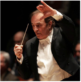
Music I'm Listening To: Charles Dutoit Conducting the San Francisco Symphony, Nikolai Lugansky Soloist

Renowned Swiss conductor Charles Dutoit is serious and precise on the podium (I'm sure he accepts no nonsense) but behind the seriousness, he seems to have a healthy sense of humor. He usually has an impish half-smile on his face and an air of amiable unflappability before and after he works. He almost dances when he conducts, seeming not so much to coax as to command music from the performers, and, apparently, they can't help playing at their best when he's in charge. At Friday night's concert (March 11, 2016), he drew forth some of the best music I've heard in a long time anywhere. Dutoit is something of a magician. On the program were Ravel's Mother Goose, Rachmaninoff's Rhapsody on a Theme of Paganini and, after intermission, Fauré's Pelléas et Mélisande Suite, and Stravinsky's Firebird Suite—a longer program than usual.

Mother Goose is rather amorphous, but it has a lot of color and interesting detail. It was well played and a good warm-up for the Rachmaninoff.

The  Rhapsody must be challenging. It frequently alternates long passages of notes that seem impossibly fast with strings of widely spaced single notes that mostly accent the orchestral part yet have to remain melodically coherent. Timing is critical to keep things together. Lugansky was nothing short of phenomenal, the orchestra behind him, equally superb. I can't imagine a better performance of this piece and have never heard a better one. Despite an enthusiastic standing ovation of several minutes, Lugansky declined to play an encore, suggesting with a gesture that his fingers weren't up to it. It was easy to forgive him. He had already done more than his duty.

Dutoit and the Symphony gave us more magic in the second half of the concert. I thought the Fauré particularly well done—lush and intense, but not overdone. Dutoit seems especially good at pushing boundaries of tempo and dynamics just enough to make familiar music exciting and fresh without going too far.

Photograph of Nikolai Lugansky by Marco Borggreve, courtesy of the San Francisco Symphony website. Photograph of Charles Dutoit, courtesy of the San Francisco Symphony Website.

Plants I'm Growing: First Blooms--Ceanothus, Rhododendrons, Michelia, Flowering Crabapple

In the past couple of weeks, a number of plants have come into bloom in the garden, including the large Julia Phelps Ceanothus outside the kitchen window; Michelia Yunnanensis, a magnolia relative native to China; our flowering crabapple tree; and the large white Rhododendron called "King George." The Ceanothus and the Michelia came into bloom on March 3, the crabapple on March 10, the Rhododendron on March 11.


Rain: Approaching Normal Levels (March 13, 2016)

More rain in the past two days (March 12-13) has added 1.30 inches to our total for the 2015-2016 rain year. So far, we have had 27.50 inches of rain at my Northeastern Santa Rosa location. Other locations are reporting slightly less than that, but the historical average for March 13 in Santa Rosa is 29.69 inches. This is the closest we've been to normal rainfall in several years. Although the rain this season hasn't been enough to make up the deficit from the past few droughty years, it's a good thing.

[Update: So far, as of 6:00PM on Sunday (March 13), we've had another 0.45 inches, but I'll update the total tomorrow morning, as it's still coming down.]

[Update: On the morning of Monday, March 14, the skies cleared. The forecast for the next few days is for sun, which will be a welcome break. That said, the precipitation has been good. The world is damp and green. A total of 0.75 inches accumulated since last reporting. That brings the total for the 2015-2016 rain year to 28.25 inches at my location--less than two inches below average.]

Thursday, March 10, 2016

The Cocktail Glass Collection: Fred's Place, Mountain View

In Palo Alto recently, I drove by this custom neon cocktail glass sign in front of Fred's Place, on Middlefield Rd., technically in Mountain View, according to Google Maps.

For more neon cocktail signs, use the "Cocktail Glass Collection" tab to the right.

Rain: More Rain (March 9-10, 2016)

It rained fairly heavily through most of the night last night. This morning I found just over an inch of new rain in the rain gauge. That brings the total for the 2015-2016 rain year at my Northeastern Santa Rosa location to 24.25 inches--and it's still raining. We remain significantly below the historical average in Santa Rosa (28.99 inches for March 10), but we're catching up and every bit helps. Updates to follow, as it's still raining and the forecast is for rain through Sunday--potentially as much as three more inches. Now the threat of flooding looms....

[Update: AS of 3:00PM on March 11, we've had another 1.95 inches of rain. That brings the total to 26.20 inches at my location. This is the closest we've been to normal precipitation in several years. If rain continues as predicted, we may actually catch up.]

Serendipitous Art: Trash (March 9, 2016)

Trash on the street in San Francisco looked like art to me. Serendipitous art, unintended art.

For more unintended art, see my blog Serendipitous Art.

Sunday, March 6, 2016

Art I'm Making: Untitled Collage No. 132 (Santa Rosa)

Another new collage—one of a group from the past few weeks using new papers I've made—mostly in yellows, browns, oranges, and pink—although I've made some all-black and all-white sheets as well, these variously tainted with other colors, an effect achieved by deliberately not washing the glass plate they were printed from.

February 17, 2016—Untitled Collage No. 132 (Santa Rosa), using monoprinted papers. Image size: 18.8 x 26.0cm. Matted to 16 x 20 inches. Signed and dated on the reverse. Signed on the mat.

Click on the image for a larger view. For more, use the "Art I'm Making" tab here to the right, or visit my collage website at: http://ctalcroft.wix.com/collage-site/

Rain: Heavy Rain Added 2.85 inches to our Total (March 5, 2016)

Heavy rain throughout the day on March 5 left 2.85 inches of new rain in the rain gauge the following morning--a very welcome addition. That brings the total at my location to 22.00 inches for the 2015-2016 rain year, which runs from October 1, 2015 to September 30, 2016. 28.36 inches is the historical average for March 6, so we are still more than 8 inches below normal, but a little more rain is forecast this week. Despite the deficit, we're better off than last year, I'd think, as it pretty much stopped raining completely last year at the end of January. The rain appears to have been fairly variable from place to place. Last time I checked, the official total for Santa Rosa was slightly higher than the total at my location, while the total reported at the website I look at to get the historical totals reports only 19.88 inches as of today. A variation of 1-2 inches even in an area as small as Santa Rosa is not unusual.

[Update: As of 9:30PM on the 6th, we'd had another 0.75 inches, bringing the total to 22.75 inches—and it's still raining.]

[Update: Drizzle and light rain has continued. By today, the morning of March 9, we've had another 0.50 inches of rain, bringing the total at my location to 23.25 inches.]

Friday, March 4, 2016

Art I'm Looking At: Art at Stanford

I recently spent a day at Stanford University. I went to see the Art-o-Mat® that's supposed to be on campus, but, despite two hours of looking—questioning telephone operators, librarians, and people in the art building and at the Cantor Arts Center—I had to give up. I imagine it's there somewhere, but apparently its exact location is a guarded secret. The Art-o-Mat website mentions "Residential Services." Their officers were closed. A subsequent phone enquiry so far has been ignored.

After giving up, I went into the Cantor Arts Center thinking I'd look at the permanent collection quickly,  but immediately I got sidetracked by a show of mannerists prints. Prints and paintings of this period usually aren't my sort of thing—but I was quickly drawn into the show (Myth, Allegory, and Faith) and ended up seeing it all, in detail.

Detail is the right word. Myth, Allegory, and Faith includes etchings, woodcuts, chiaroscuro woodcuts, and engravings, but most of the prints on show were the latter—and engravings often of astonishing precision. Magnifying glasses, tethered to the walls, were provided to facilitate seeing the finest of lines, a nice touch. It's hard to imagine the time and effort required to produce this kind of work. I enjoyed nearly every piece there was to see, but favorites included: David Beheading Goliath (1540), an engraving by Giovanni Battista Scultori (1503-1575), shown below; Without Ceres and Bacchus, Venus Grows Cold (1600), by Jan Saenredam (Dutch, 1565-1607), shown left; Saturn (c. 1540, printed 1604), a four-block chiaroscuro woodcut by Giuseppe Niccolo Vicentino (Italian, active 1540s), after Pordenone; Neptune and Thetis (after 1551 to 1580), an engraving by René Boyvin (French, 1530-1598) after Léonard Thiry; The Three Fates (1538-1540), an engraving by Pierre Milan (French, active 1540 to around 1557); The Rest on the Return from Egypt (1575), an engraving by Cornelis Cort (Dutch, 1533 to before 1578), after Federico Barocci; and Venus and Cupid (1505-1536), an etching by Daniel Hopfer (German, 1470-1536), among many others. The luminous quality achieved in the engravings in particular was startling. Nearly every print included the human form—notoriously difficult to capture accurately in any medium, particularly when foreshortened. These artists have succeeded, using overlapping engraved lines that in some instances wrap themselves around contours with such natural grace and rightness that they beggar belief. Well worth the time. Through June 20, 2016.


I also saw an interesting group of drawings of the Battle of The Little Bighorn by one of its participants, one Chief Red Horse of the Minneconjou Lakota Sioux, who fought against Custer there, and a small (one-room) exhibition called Speed and Power, a rather disparate grouping of photographs from the Cantor Art Center's permanent collection. While the theme seemed a little forced, there were a few gems among them. I particularly enjoyed Mechanical Form 003 (2004) by Hiroshi Sugimoto (1948- ), shown here, and Satiric Dancer (1926), by André Kertész (1894-1985).

I had intended to look at the new Hopper and the Diebenkorn sketchbooks again at the Cantor Arts Center, but, with time running short and having seen them back in December, I headed next door to The Anderson Collection, in a low, modern building that looks closed even when it's not. I wanted to get a taste of the place to see if it was worth coming back to for a more leisurely look. Worth it? Yes.

The building (itself very interesting) houses only a portion of the personal collection of the Andersons (whoever they are—I didn't have time to find out*), who must be in the upper 1% of the 1%. Frankenthaler, Motherwell, Diebenkorn, Pollock, Guston, De Kooning, Nevelson, Rothko, Morris Louis, Wayne Thiebaud—many more. Just what's on display here would make a very fine museum of post-war modern art for a fairly large city, yet this is only one part of a much larger collection in the possession of a single family. I particularly enjoyed a black Louise Nevelson sculpture positioned directly across a passageway from a large set of black metal elevator doors—creating a pair of bookends—with an uncharacteristically dull De Kooning visible between them (the De Kooning one of the very few duds in the place.) Definitely worth another visit. Below is Wall Painting No. IV (1954), by Robert Motherwell (1915-1991).


*Following my visit, I looked at the website for The Anderson Collection.

Thursday, March 3, 2016

Rain: A Little More Rain (February 3, 2016)

A little rain last night and today, mostly just drizzle, has added 0.25 inches of rain to our 2015-2016 precipitation total. More rain is on the way. So far, we stand at 19.15 inches at my location.

Sunday, February 28, 2016

Art I'm Making: Untitled Collage No. 131 (Santa Rosa)

Another new collage—one of a group I've made rapidly in the past two weeks , inspired by new papers I've made—mostly in yellow, brown, orange, and pink, but I've made some all-black and all-white sheets as well. This piece, more about form than color, uses the black sheets almost exclusively.

February 16, 2016Untitled Collage No. 131 (Santa Rosa), using monoprinted papers. Image size: 10.8 x 19.5cm. Matted to 16 x 20 inches. Signed and dated on the reverse. Signed on the mat.

Click on the image for a larger view. For more, visit my collage website at: http://ctalcroft.wix.com/collage-site/

Art I'm Looking At: Bonnard at The Legion of Honor

Pierre Bonnard, The Table (1925)
Tate Gallery, London
The Legion of Honor, in San Francisco, is now exhibiting a large group of works by Pierre Bonnard (1867-1947), the first major show of the artist's work on the West Coast in 50 years, according to the Legion's website. The show is Pierre Bonnard: Painting Arcadia.

The layout is roughly, although not strictly, chronological. The first spaces focus on early work, generally from around 1890—the artist's Nabi period. The latest pieces are from the mid-1930s or so, but most of the work is arranged thematically. One grouping is mostly nudes, another mostly interiors. Later rooms focus on large mural-like pieces Bonnard painted for patrons.

Pierre Bonnard, Table Corner (1935)
Bonnard's career was a long one. In terms of artistic movements, his working life spanned late Impressionism, Post-Impressionism, Pointillism, Art Nouveau, Symbolism, Expressionism, Fauvism, Futurism, Surrealism, the rise of pure abstraction in the Western artistic tradition, Art Deco, and Cubism, not to mention coinciding with a period of great evolution in photography. Yet, Bonnard always did his own thing. Although his work is clearly of its time (sometimes reminiscent of Matisse or Dufy), although his instincts were aligned with those of the Post-impressionists and the Symbolists, and despite a strong impact on his sensibilities from Japanese art, he never was tempted to experiment with Cubist deformation or to embrace abstraction, even as those two trends began to dominate modern art in the West. His favorite subjects remained richly colored interiors, somewhat mysterious nudes in interiors, and landscape and lush vegetation. Although some of Bonnard's work has strong abstract qualities—in this show, notably Table Corner (1935)—he never completely gave in to the abstract impulse. Ultimately, he was a sensualist.

Pierre Bonnard Nude Before the Mirror (detail; 1931)
Galleria Internazionale d'Arte Moderna at Ca' Pesaro, Venice
The brushstroke is always evident. There is no attempt at strict realism, there is no attempt to hide the hand of the artist, to create an illusion of reality. His technique is thoroughly modern if we understand modern to have begun with Impressionism. His technical proclivities could be quite contradictory; he was at once fond of thin washes that let canvas show through the paint and of leaving areas of canvas entirely untouched—this transparency creating an effect suggestive of watercolor—while happily applying heavy dabs of paint right from the tube in other areas, or applying thick, creamy layers of paint for effect. Nude Before the Mirror (1931), on loan from Galleria Internazionale d'Arte Moderna at Ca' Pesaro, in Venice, provides an excellent example of the transparency. Shown here is a detail of what appear to be curtains at a window behind the nude figure (above). In contrast, in The Table (1925), on loan from the Tate Gallery, London, (top of this page), Bonnard's impasto nicely suggests slabs of creamy cheese and shrimp on crackers and his lemons glow with thick oval smears of cadmium yellow. The slatherings of Wayne Thiebaud come to mind.
      
Pierre Bonnard, Woman Dozing on a Bed (1899)
Musée d'Orsay, Paris
The nudes are somewhat unsettling. They are always ambivalent—simultaneously a celebration of the female body and expressive of uneasiness. Woman Dozing on a Bed (1899), from the Musée d'Orsay, depicting the artist's lover (and later wife) Maria Boursin (also known as Marthe de Méligny), stretched out on a bed, is something of an exception. It seems a comparatively straightforward record of post-coital indolence (the painting is also known as The Indolent Woman). The painting captures lust renewed by the sight of lust temporarily slaked. It is the most purely erotic painting among the nudes. It brings Modigliani to mind in its apparent motivation, if not in style. Yet this painting, too, has deeper nuances. Stylistically, it evokes Edvard Munch, and no 20th century artist was better at expressing anxiety about sex and desire than Munch. A cat is curled up in the shadow of the model's hair. Everywhere there are cats.

Pierre Bonnard, Nude in the Bathtub (1925)
Tate Gallery, London
Some of Bonnard's later nudes seem more relaxed, as if the artist decided it's better in the end to celebrate sensuality (Woman Dozing on a Bed is an early work—among Bonnard's first nudes) even if he can never allow himself (or us) to be entirely at ease. Although the unsettling effects I speak of are real—created by veiled faces, turned-away poses, odd perspectives, and startling truncations—simultaneously there is much beauty in the nudes and their settings. In some of these paintings, color, surface pattern, and the female form manage to appear more important than oddities of composition, and, subordinated to the figure, they enhance rather than detract from sensual qualities. In others, however, it's harder to make a case for pure sensuality. Bonnard is paradoxical. Nude in the Bathtub (1925), from the Tate, London, is a case in point. The figure is cut off at the hips, partially submerged in a bathtub that appears lifted several feet off the floor—in the room but not of the room. Another figure, apparently male, perhaps the artist, enters from the left. Time seems to have stopped. It is a pregnant pause. The Bathtub (below), also from 1925 and in the Tate London collection, is similar.

Pierre Bonnard, The Bathtub (1925)
Tate Gallery, London
Pierre Bonnard, Marthe in the Bath, (c. 1908-1910)
Other highlights of the show include a group of rarely seen self-portraits and photographs by Bonnard, mostly small (about  2 x 2.5 inch) snapshots of friends and family, including travel photos. These small photos are modern prints from the original negatives. They're probably contact prints (printed at the same size as the negative), although enlarged in the exhibition catalog (and here). Wall text gives no information about size, but goes out of its way to point out that these were snapshots, that Bonnard would not have considered them artistic work. Nevertheless, a clear sense of composition is apparent in all the images, and one, Marthe in the Bath, a nude of Marthe de Méligny, with its ambiguous foreground and motion-blurred face, has all the qualities of the painted nudes.

The large mural-sized works that close the show include two of special interest, a pair of works commissioned by art critic George Besson for his Paris apartment. The first, completed in 1912, is a daytime scene. The second, from 1928, a full 16 years later, is a night scene (shown here). Both depict La Place Clichy, in Paris, as seen from inside a brasserie. Bonnard certainly loved cadmium yellow—and cats.

Pierre Bonnard, La Place Clichy (1928)
A large number of the paintings on display are from The Musée d'Orsay, in Paris, the Tate, London, and the National Gallery, in Washington D.C., and from other museums I've visited on multiple occasions. Despite that, and, although I've always admired Bonnard's work, I can't remember seeing a single piece in this show before. Everything seemed fresh. There are more than 70 works on display, but the galleries have been generously allocated. Nothing seems crowded. There is just enough to be deeply satisfying without causing fatigue. Notable for the quality of the work and for its breadth, going well beyond Bonnard's Nabi period, Pierre Bonnard: Painting Arcadia runs at the Legion of Honor through May 15, 2016.
Related Posts with Thumbnails