

Thursday, March 31, 2016
Art I'm Looking At: Lewis Bodecker—Paintings and Drawings on The Art Wall at Shige Sushi


Tuesday, March 29, 2016
Art I'm Making; Collage/Assemblage at O'Hanlon Center for the Arts, Mill Valley (March 31 - April 21, 2016)

Sunday, March 20, 2016
Art I'm Making: My First Cyanotype Attempt--An Interesting Failure (March 20, 2016)

The image shown here was made using the Bostick & Sullivan cyanotype kit, a traditional cyanotype formula. I used 90 drops of finished solution (45 drops each of parts A and B mixed) to coat an 11 x 14 inch sheet of paper. The exposure was about 8 minutes in late afternoon sunlight on March 19, 2016 (partly cloudy). The digital negative (printed on PictoricoPro transparency film, using the glossy photo setting on an Epson 3880 printer) was made from a color digital image converted to B&W that I then adjusted using a cyanotype curve I found online. I next converted the B&W image to orange by using Color Balance, in Photoshop, boosting the yellow and red sliders all the way up. I then flipped the image horizontally so that the image would be right way around when placed against the cyanotype paper with the printed side closest to the paper (flipped). With the rain, I'll be able to expose no more images today, but I may go to the art supply store to seek a better paper to work on. I'm also reading up on toning cyanotype prints with tea, which darkens the highlights a little and converts the bright Prussian blue of the cyanotype to a bluish brown.
[Now, more than two years later (in November 2018), I'm trying to learn cyanotype photography in earnest. Here's a link to a post about my latest efforts.]
Rain: More Rain (March 20-21, 2016)
It started raining again on March 20, the rain continuing into the following day. By the end of the 21st, we had 0.80 inches of new precipitation in the rain gauge, which brings the total for the 2015-2016 rain year to 29.10 inches at my location in northeast Santa Rosa. The historical average for Santa Rosa is a little over 36 inches.
Friday, March 18, 2016
Art I'm Making : Untitled Collage No. 134 (Santa Rosa)

This is Untitled Collage No. 134 (Santa Rosa). February 23, 2016. Acrylic on paper, acrylic monoprint, collage. Image size: 16.1 x 18.0cm. Matted to 16 x 20 inches. Signed and dated on reverse. Signed on the mat.
Click on the image for a larger view. For more, use the "Art I'm Making" tab here, or visit my collage website at: http://ctalcroft.wix.com/collage-site/
Monday, March 14, 2016
Art I'm Making: Untitled Collage No. 133 (Santa Rosa)

Click on the image for a larger view. For more, use the "Art I'm Making" tab to the right, or visit my collage website at: http://ctalcroft.wix.com/collage-site/
Sunday, March 13, 2016
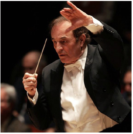
Music I'm Listening To: Charles Dutoit Conducting the San Francisco Symphony, Nikolai Lugansky Soloist

The Rhapsody must be challenging. It frequently alternates long passages of notes that seem impossibly fast with strings of widely spaced single notes that mostly accent the orchestral part yet have to remain melodically coherent. Timing is critical to keep things together. Lugansky was nothing short of phenomenal, the orchestra behind him, equally superb. I can't imagine a better performance of this piece and have never heard a better one. Despite an enthusiastic standing ovation of several minutes, Lugansky declined to play an encore, suggesting with a gesture that his fingers weren't up to it. It was easy to forgive him. He had already done more than his duty.
Dutoit and the Symphony gave us more magic in the second half of the concert. I thought the Fauré particularly well done—lush and intense, but not overdone. Dutoit seems especially good at pushing boundaries of tempo and dynamics just enough to make familiar music exciting and fresh without going too far.
Photograph of Nikolai Lugansky by Marco Borggreve, courtesy of the San Francisco Symphony website. Photograph of Charles Dutoit, courtesy of the San Francisco Symphony Website.
Plants I'm Growing: First Blooms--Ceanothus, Rhododendrons, Michelia, Flowering Crabapple


Rain: Approaching Normal Levels (March 13, 2016)
More rain in the past two days (March 12-13) has added 1.30 inches to our total for the 2015-2016 rain year. So far, we have had 27.50 inches of rain at my Northeastern Santa Rosa location. Other locations are reporting slightly less than that, but the historical average for March 13 in Santa Rosa is 29.69 inches. This is the closest we've been to normal rainfall in several years. Although the rain this season hasn't been enough to make up the deficit from the past few droughty years, it's a good thing.
[Update: So far, as of 6:00PM on Sunday (March 13), we've had another 0.45 inches, but I'll update the total tomorrow morning, as it's still coming down.]
[Update: On the morning of Monday, March 14, the skies cleared. The forecast for the next few days is for sun, which will be a welcome break. That said, the precipitation has been good. The world is damp and green. A total of 0.75 inches accumulated since last reporting. That brings the total for the 2015-2016 rain year to 28.25 inches at my location--less than two inches below average.]
[Update: So far, as of 6:00PM on Sunday (March 13), we've had another 0.45 inches, but I'll update the total tomorrow morning, as it's still coming down.]
[Update: On the morning of Monday, March 14, the skies cleared. The forecast for the next few days is for sun, which will be a welcome break. That said, the precipitation has been good. The world is damp and green. A total of 0.75 inches accumulated since last reporting. That brings the total for the 2015-2016 rain year to 28.25 inches at my location--less than two inches below average.]
Thursday, March 10, 2016
The Cocktail Glass Collection: Fred's Place, Mountain View

For more neon cocktail signs, use the "Cocktail Glass Collection" tab to the right.
Rain: More Rain (March 9-10, 2016)
It rained fairly heavily through most of the night last night. This morning I found just over an inch of new rain in the rain gauge. That brings the total for the 2015-2016 rain year at my Northeastern Santa Rosa location to 24.25 inches--and it's still raining. We remain significantly below the historical average in Santa Rosa (28.99 inches for March 10), but we're catching up and every bit helps. Updates to follow, as it's still raining and the forecast is for rain through Sunday--potentially as much as three more inches. Now the threat of flooding looms....
[Update: AS of 3:00PM on March 11, we've had another 1.95 inches of rain. That brings the total to 26.20 inches at my location. This is the closest we've been to normal precipitation in several years. If rain continues as predicted, we may actually catch up.]
[Update: AS of 3:00PM on March 11, we've had another 1.95 inches of rain. That brings the total to 26.20 inches at my location. This is the closest we've been to normal precipitation in several years. If rain continues as predicted, we may actually catch up.]
Serendipitous Art: Trash (March 9, 2016)

For more unintended art, see my blog Serendipitous Art.
Sunday, March 6, 2016
Art I'm Making: Untitled Collage No. 132 (Santa Rosa)

February 17, 2016—Untitled Collage No. 132 (Santa Rosa), using monoprinted papers. Image size: 18.8 x 26.0cm. Matted to 16 x 20 inches. Signed and dated on the reverse. Signed on the mat.
Click on the image for a larger view. For more, use the "Art I'm Making" tab here to the right, or visit my collage website at: http://ctalcroft.wix.com/collage-site/
Rain: Heavy Rain Added 2.85 inches to our Total (March 5, 2016)
Heavy rain throughout the day on March 5 left 2.85 inches of new rain in the rain gauge the following morning--a very welcome addition. That brings the total at my location to 22.00 inches for the 2015-2016 rain year, which runs from October 1, 2015 to September 30, 2016. 28.36 inches is the historical average for March 6, so we are still more than 8 inches below normal, but a little more rain is forecast this week. Despite the deficit, we're better off than last year, I'd think, as it pretty much stopped raining completely last year at the end of January. The rain appears to have been fairly variable from place to place. Last time I checked, the official total for Santa Rosa was slightly higher than the total at my location, while the total reported at the website I look at to get the historical totals reports only 19.88 inches as of today. A variation of 1-2 inches even in an area as small as Santa Rosa is not unusual.
[Update: As of 9:30PM on the 6th, we'd had another 0.75 inches, bringing the total to 22.75 inches—and it's still raining.]
[Update: Drizzle and light rain has continued. By today, the morning of March 9, we've had another 0.50 inches of rain, bringing the total at my location to 23.25 inches.]
[Update: As of 9:30PM on the 6th, we'd had another 0.75 inches, bringing the total to 22.75 inches—and it's still raining.]
[Update: Drizzle and light rain has continued. By today, the morning of March 9, we've had another 0.50 inches of rain, bringing the total at my location to 23.25 inches.]
Friday, March 4, 2016
Art I'm Looking At: Art at Stanford
I recently spent a day at Stanford University. I went to see the Art-o-Mat® that's supposed to be on campus, but, despite two hours of looking—questioning telephone operators, librarians, and people in the art building and at the Cantor Arts Center—I had to give up. I imagine it's there somewhere, but apparently its exact location is a guarded secret. The Art-o-Mat website mentions "Residential Services." Their officers were closed. A subsequent phone enquiry so far has been ignored.
 After giving up, I went into the Cantor Arts Center thinking I'd look at the permanent collection quickly, but immediately I got sidetracked by a show of mannerists prints. Prints and paintings of this period usually aren't my sort of thing—but I was quickly drawn into the show (Myth, Allegory, and Faith) and ended up seeing it all, in detail.
Detail is the right word. Myth, Allegory, and Faith includes etchings, woodcuts, chiaroscuro woodcuts, and engravings, but most of the prints on show were the latter—and engravings often of astonishing precision. Magnifying glasses, tethered to the walls, were provided to facilitate seeing the finest of lines, a nice touch. It's hard to imagine the time and effort required to produce this kind of work. I enjoyed nearly every piece there was to see, but favorites included: David Beheading Goliath (1540), an engraving by Giovanni Battista Scultori (1503-1575), shown below; Without Ceres and Bacchus, Venus Grows Cold (1600), by Jan Saenredam (Dutch, 1565-1607), shown left; Saturn (c. 1540, printed 1604), a four-block chiaroscuro woodcut by Giuseppe Niccolo Vicentino (Italian, active 1540s), after Pordenone; Neptune and Thetis (after 1551 to 1580), an engraving by René Boyvin (French, 1530-1598) after Léonard Thiry; The Three Fates (1538-1540), an engraving by Pierre Milan (French, active 1540 to around 1557); The Rest on the Return from Egypt (1575), an engraving by Cornelis Cort (Dutch, 1533 to before 1578), after Federico Barocci; and Venus and Cupid (1505-1536), an etching by Daniel Hopfer (German, 1470-1536), among many others. The luminous quality achieved in the engravings in particular was startling. Nearly every print included the human form—notoriously difficult to capture accurately in any medium, particularly when foreshortened. These artists have succeeded, using overlapping engraved lines that in some instances wrap themselves around contours with such natural grace and rightness that they beggar belief. Well worth the time. Through June 20, 2016.

 I also saw an interesting group of drawings of the Battle of The Little Bighorn by one of its participants, one Chief Red Horse of the Minneconjou Lakota Sioux, who fought against Custer there, and a small (one-room) exhibition called Speed and Power, a rather disparate grouping of photographs from the Cantor Art Center's permanent collection. While the theme seemed a little forced, there were a few gems among them. I particularly enjoyed Mechanical Form 003 (2004) by Hiroshi Sugimoto (1948- ), shown here, and Satiric Dancer (1926), by André Kertész (1894-1985).
 I had intended to look at the new Hopper and the Diebenkorn sketchbooks again at the Cantor Arts Center, but, with time running short and having seen them back in December, I headed next door to The Anderson Collection, in a low, modern building that looks closed even when it's not. I wanted to get a taste of the place to see if it was worth coming back to for a more leisurely look. Worth it? Yes.
The building (itself very interesting) houses only a portion of the personal collection of the Andersons (whoever they are—I didn't have time to find out*), who must be in the upper 1% of the 1%. Frankenthaler, Motherwell, Diebenkorn, Pollock, Guston, De Kooning, Nevelson, Rothko, Morris Louis, Wayne Thiebaud—many more. Just what's on display here would make a very fine museum of post-war modern art for a fairly large city, yet this is only one part of a much larger collection in the possession of a single family. I particularly enjoyed a black Louise Nevelson sculpture positioned directly across a passageway from a large set of black metal elevator doors—creating a pair of bookends—with an uncharacteristically dull De Kooning visible between them (the De Kooning one of the very few duds in the place.) Definitely worth another visit. Below is Wall Painting No. IV (1954), by Robert Motherwell (1915-1991).

*Following my visit, I looked at the website for The Anderson Collection.

Detail is the right word. Myth, Allegory, and Faith includes etchings, woodcuts, chiaroscuro woodcuts, and engravings, but most of the prints on show were the latter—and engravings often of astonishing precision. Magnifying glasses, tethered to the walls, were provided to facilitate seeing the finest of lines, a nice touch. It's hard to imagine the time and effort required to produce this kind of work. I enjoyed nearly every piece there was to see, but favorites included: David Beheading Goliath (1540), an engraving by Giovanni Battista Scultori (1503-1575), shown below; Without Ceres and Bacchus, Venus Grows Cold (1600), by Jan Saenredam (Dutch, 1565-1607), shown left; Saturn (c. 1540, printed 1604), a four-block chiaroscuro woodcut by Giuseppe Niccolo Vicentino (Italian, active 1540s), after Pordenone; Neptune and Thetis (after 1551 to 1580), an engraving by René Boyvin (French, 1530-1598) after Léonard Thiry; The Three Fates (1538-1540), an engraving by Pierre Milan (French, active 1540 to around 1557); The Rest on the Return from Egypt (1575), an engraving by Cornelis Cort (Dutch, 1533 to before 1578), after Federico Barocci; and Venus and Cupid (1505-1536), an etching by Daniel Hopfer (German, 1470-1536), among many others. The luminous quality achieved in the engravings in particular was startling. Nearly every print included the human form—notoriously difficult to capture accurately in any medium, particularly when foreshortened. These artists have succeeded, using overlapping engraved lines that in some instances wrap themselves around contours with such natural grace and rightness that they beggar belief. Well worth the time. Through June 20, 2016.

 I also saw an interesting group of drawings of the Battle of The Little Bighorn by one of its participants, one Chief Red Horse of the Minneconjou Lakota Sioux, who fought against Custer there, and a small (one-room) exhibition called Speed and Power, a rather disparate grouping of photographs from the Cantor Art Center's permanent collection. While the theme seemed a little forced, there were a few gems among them. I particularly enjoyed Mechanical Form 003 (2004) by Hiroshi Sugimoto (1948- ), shown here, and Satiric Dancer (1926), by André Kertész (1894-1985).
The building (itself very interesting) houses only a portion of the personal collection of the Andersons (whoever they are—I didn't have time to find out*), who must be in the upper 1% of the 1%. Frankenthaler, Motherwell, Diebenkorn, Pollock, Guston, De Kooning, Nevelson, Rothko, Morris Louis, Wayne Thiebaud—many more. Just what's on display here would make a very fine museum of post-war modern art for a fairly large city, yet this is only one part of a much larger collection in the possession of a single family. I particularly enjoyed a black Louise Nevelson sculpture positioned directly across a passageway from a large set of black metal elevator doors—creating a pair of bookends—with an uncharacteristically dull De Kooning visible between them (the De Kooning one of the very few duds in the place.) Definitely worth another visit. Below is Wall Painting No. IV (1954), by Robert Motherwell (1915-1991).

*Following my visit, I looked at the website for The Anderson Collection.
Thursday, March 3, 2016
Rain: A Little More Rain (February 3, 2016)
A little rain last night and today, mostly just drizzle, has added 0.25 inches of rain to our 2015-2016 precipitation total. More rain is on the way. So far, we stand at 19.15 inches at my location.
Sunday, February 28, 2016
Art I'm Making: Untitled Collage No. 131 (Santa Rosa)

February 16, 2016—Untitled Collage No. 131 (Santa Rosa), using monoprinted papers. Image size: 10.8 x 19.5cm. Matted to 16 x 20 inches. Signed and dated on the reverse. Signed on the mat.
Click on the image for a larger view. For more, visit my collage website at: http://ctalcroft.wix.com/collage-site/
Art I'm Looking At: Bonnard at The Legion of Honor
 |
| Pierre Bonnard, The Table (1925) Tate Gallery, London |
The layout is roughly, although not strictly, chronological. The first spaces focus on early work, generally from around 1890—the artist's Nabi period. The latest pieces are from the mid-1930s or so, but most of the work is arranged thematically. One grouping is mostly nudes, another mostly interiors. Later rooms focus on large mural-like pieces Bonnard painted for patrons.
 |
| Pierre Bonnard, Table Corner (1935) |
 |
| Pierre Bonnard Nude Before the Mirror (detail; 1931) Galleria Internazionale d'Arte Moderna at Ca' Pesaro, Venice |
 |
| Pierre Bonnard, Woman Dozing on a Bed (1899) Musée d'Orsay, Paris |
 |
| Pierre Bonnard, Nude in the Bathtub (1925) Tate Gallery, London |
 |
| Pierre Bonnard, The Bathtub (1925) Tate Gallery, London |
 |
| Pierre Bonnard, Marthe in the Bath, (c. 1908-1910) |
The large mural-sized works that close the show include two of special interest, a pair of works commissioned by art critic George Besson for his Paris apartment. The first, completed in 1912, is a daytime scene. The second, from 1928, a full 16 years later, is a night scene (shown here). Both depict La Place Clichy, in Paris, as seen from inside a brasserie. Bonnard certainly loved cadmium yellow—and cats.
 |
| Pierre Bonnard, La Place Clichy (1928) |
Friday, February 26, 2016
Art I'm Making: Untitled Collage No. 130 (Santa Rosa)

February 16, 2016—Untitled Collage No. 130 (Santa Rosa), using monoprinted papers. Image size: 14.2 x 15.6cm. Matted to 20 x 16 inches. Signed and dated on the reverse. Signed on the mat.
Click on the image for a larger view. For more, visit my collage website at: http://ctalcroft.wix.com/collage-site/
Places I'm Visiting: Art-o-Mat® at the San Carlos Public Library

This time I chose a small flipbook made from barcodes. The subject of the piece I got turned out to be Bruce Lee, the work of Scott Blake, who seems to like to make images out of barcodes. The little flip book zooms in on Barcode Bruce Lee, "a digital mosaic made entirely of barcodes from movie DVDs the Chinese martial artist appeared in."
This is the fourth Art-o-Mat® I've seen so far. There are eleven in California, 142 or so nationwide. I hope to visit the one on the Stanford University campus next. An Art-o-Mat® is a vintage cigarette machine converted to dispensing art rather than cigarettes. For more about the Art-o-Mat®, see this post.
Plants I'm Growing: First Blooms--Tulips, Daffodils, Fruit Trees, and Rhododendrons (Late February 2016)


The Cocktail Glass Collection: High Tide Cocktails, San Francisco

For more, use the "Cocktail Glass Collection" tab to the right at the top of the page.
Tuesday, February 23, 2016
Art I'm Making: Untitled Collage No. 129 (Santa Rosa)

Click on the image for a larger view. For more, visit my collage website at: http://ctalcroft.wix.com/collage-site/
Places I'm Visiting: The Art-o-Mat® at San Francisco's Exploratorium

The art vending machine at The Exploratorium turned out to be in the Exploratorium shop, which is accessible without paying the entry fee. I bought a piece of art (as well as a T-shirt showing the periodic table of elements and a little electric robot kit that draws random patterns with pens).
An Art-o-Mat® is a vintage cigarette machine converted to dispensing art rather than cigarettes. This is the third one I've visited of 11 in California. For more about the Art-o-Mat®, see this post.
Thursday, February 18, 2016
Serendipitous Art: Reflected Window Light (February 18, 2016)

For more unintended art, see my blog Serendipitous Art.
Art I'm Making: Untitled Collage No. 128 (Santa Rosa)

[Update: This image was subsequently sold to Imagery Estate Winery and is in the winery's permanent collection. It appeared in 2017 on the label of their 2016 Muscat de Canelli.]
Click on the image for a larger view. For more, visit my collage website at: http://ctalcroft.wix.com/collage-site/
Rain: Rain Again (February 17-18, 2016)
We had the first new rain today, February 17, since February 2. By afternoon 0.45 inches had accumulated and it was still raining early into the morning of the 18th. The total was 17.65 inches on February 2, which means we are now over 18 inches, but rain is in the forecast for the next day or two.
[Update: By the morning of February 18 (that is, by the time I awoke on the 18th), there was 0.90 inches of new rain in the rain gauge. That brings our 2015-2016 total to 18.55 inches at my location in Santa Rosa, although other stations are reporting somewhat less. The historical average for February 18 in Santa Rosa is 24.53 inches, so, the two-week dry spell that just ended set us back considerably. We are six inches behind normal again. What happened to El Niño?]
[Update: More rain on the night of the 18th and into the 19th added 0.35 inches. So, as of 5:00PM on the 19th, our 2015-2016 total stood at 18.90 inches (at my location; some local media have reported a little over 20 inches.]
[Update: By the morning of February 18 (that is, by the time I awoke on the 18th), there was 0.90 inches of new rain in the rain gauge. That brings our 2015-2016 total to 18.55 inches at my location in Santa Rosa, although other stations are reporting somewhat less. The historical average for February 18 in Santa Rosa is 24.53 inches, so, the two-week dry spell that just ended set us back considerably. We are six inches behind normal again. What happened to El Niño?]
[Update: More rain on the night of the 18th and into the 19th added 0.35 inches. So, as of 5:00PM on the 19th, our 2015-2016 total stood at 18.90 inches (at my location; some local media have reported a little over 20 inches.]
Monday, February 15, 2016
Plants I'm Growing: First Blooms—Pink Flowering Plum, Golden Currant, "Dapple Dandy" Pluot

"Dapple Dandy" bloomed on February 5, 15, 4, 2, 23, and 3 in 2009 to 2014, so a first bloom date of February 11 is neither early nor late.

The golden currant has bloomed as early as February 10 (in 2011) and as late as March 5 (2013), so a first bloom date of February 5 is somewhat earlier than usual.

Sunday, February 14, 2016
Places I'm Visiting/Art I'm Looking At: Aline Smithson at The Rayko Photo Center

The Photo Center has camera displays (some for show, some for sale), formal gallery space, some informal space that was showing student work, a large selection of the work of local photographers for sale, and rental studio space and darkrooms (both digital and analog), as well as work areas for mounting and matting prints. The center has a regular schedule of classes. Virtually everything to do with photography is here. There is even a vintage photo booth in the space.
Among the photographs for sale, I particularly liked work by Ryuten Paul Rosenblum, Cherie Mayman, and Nicolo Sertorio. I was impressed by Ella Dean among the student photographers. Cherie Mayman's piece was a blurry, dreamy platinum print of what looked like bottles suspended in the air.
 The main show was Self and Others, work by Aline Smithson from a number of different series. A few of the images are black and white. Most are large color prints. The various series—portraiture broadly defined for the most part—seemed united by a fondness for large, mostly unarticulated areas of bold color and an isolated subject, often looking right at the camera or just off camera, although a series entitled Arrangement in Green and Black: Portrait of the Photographer's Mother is a set of 21 plays on Whistler's famous portrait of his mother, all imitating that work by using the photographer's mother seated sideways to the picture plane against a plain background (pale green and black in this case) with a painting hanging on the wall behind. The subject is flamboyantly dressed, the attire very different from the drab colors Whistler's mother wears. The paintings on the wall are likewise a sharp departure from the grey and palest beige of the print on the wall in Whistler's painting, yet each of Smithson's hand-colered images is anchored by the strength of Whistler's simple composition.

The next show at Rayko Photo Center will be The Ninth Annual Plastic Camera Show, opening March 9 and running through April 29. Opening reception on the first day of the show, March 9, 2016.
Tuesday, February 9, 2016
Art I'm Making: Untitled Collage No. 127 (Santa Rosa)

Untitled Collage No. 127 (Santa Rosa). January 30, 2016. Acrylic on paper, acrylic monoprint, collage. Image size: 10.5 x 13.8cm. Matted to 11 x 14 inches. Signed and dated on reverse. Signed on the mat.
Click on the image for a larger view. For more, visit my collage website at: http://ctalcroft.wix.com/collage-site/
Subscribe to:
Posts (Atom)



 Posts
Posts


